Photo Critiqing Thread

Lost Canadian

Expedition Leader
We had a good rain storm Sunday afternoon so I took the family up the hill to see if I could catch a few crisp clear pictures of Timp. The rain had come and gone and there were still nice low lying clouds hanging around. There seemed to be a lot of that humid Haze as well so I was a little disappointed in the clarity of the pictures I took. That and my kids decided to have a weed fight in front of the camera and somehow I got a wet spot on the lens (hazy ghosts on the lower left. Nikon D90 18-200, F22, A1/60, 35mm, iso 800 with a UV filter. I shot from a tripod on a timer.

Couple comments for ya that may help. First and probably the most relevant is with respects to your settings. You shot at 35mm on an APS-C sensor, F22 is way too small of aperture with digital and you're robbing yourself of resolution. Going beyond F11 on your camera, especially shooting at 35mm is really unnecessary unless you're trying to be creative with longer exposures, because diffraction is going to rob you of any clarity you hope to gain with increased depth of field. If I were taking that shot I would have been at around F5.6. That puts you in the sweet spot for sharpness and would provide you with plenty of depth at that focal length. The next thing is your ISO, if you were on a tripod, there really is nothing to gain by being at ISO 800 other than noise. A lower ISO will provide increased dynamic range, lower noise, and increased fine detail. For landscapes, in general anyway, a lower ISO setting is always going to be better, there are some exceptions of course. The only other grip is the big dust spot in the centre of the sky. Clean your sensor and clone that out.

Compositionally you're fine. Subject is nice, light looks good. It appears as though there are some opportunities for increased drama with the low sweeping clouds. A long exposure may have added some energy to this shot.
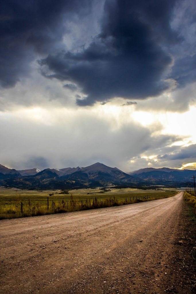
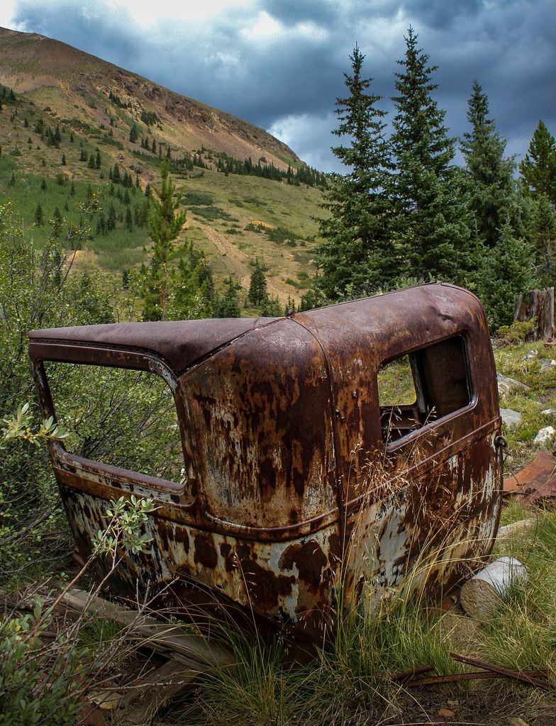
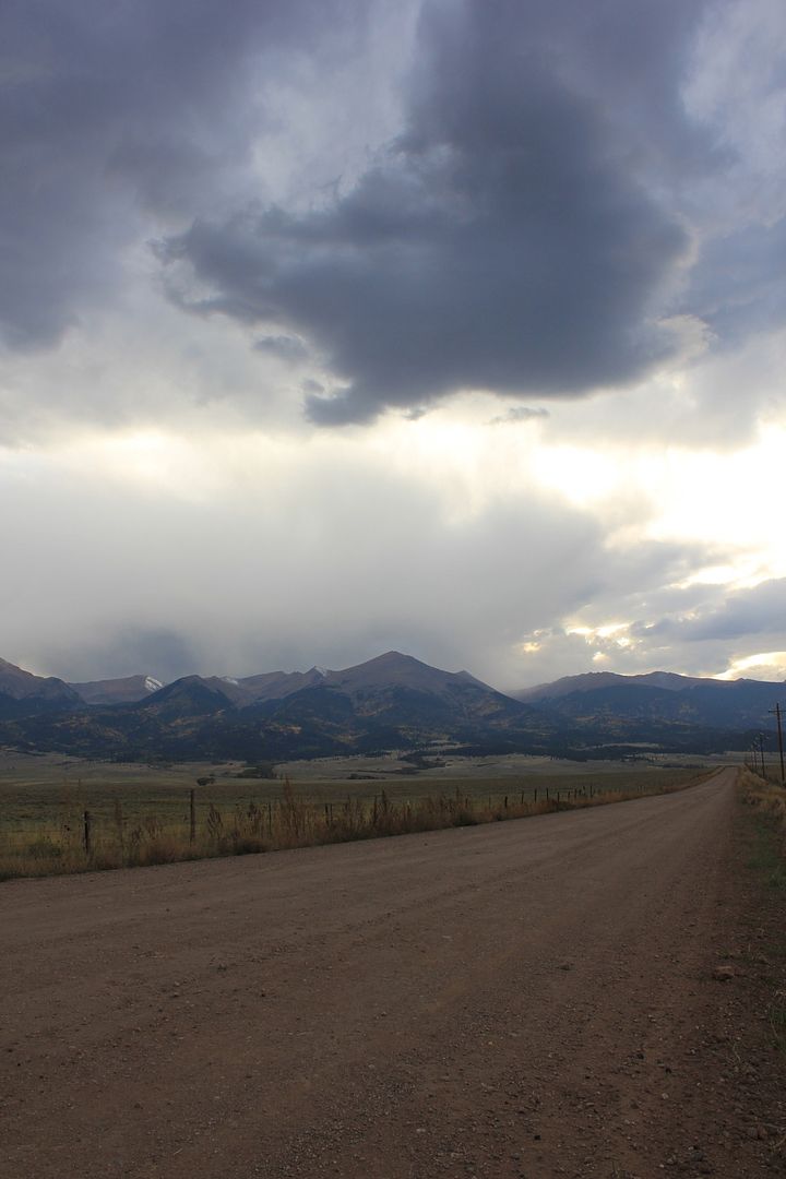
 

cruisertoy

Explorer
NW and LC. Thanks a ton for your comments. Very helpful. To be honest I spaced checking my ISO and had it set for some shots a did the week before. I need to pay attention to all my settings.

I'll head back up the next chance I get and play with the aperture as you have suggested. That relationship between the 35mm and Aperture is a challenge for me. I will dial it back a bit and see where we end up. Luckily the view point is just a few minutes from the house. And I'll leave the kids at home.
 

Bushmaster6

Adventurer
resurrecting this thread (again) because I found it very useful and for feedback

I've posted periodically in this forum, including a thread about 18 months ago about editing software (which steered me to purchasing and using Lightroom 5).. the more I practice and study, the more value I have returning to read this thread, as more of the critiques make sense as I learn

improving my Photography has been an aspirational goal for me, especially in the last several years, but it's been a frustrating process for me getting results ouf of my minds-eye and in to products.. I've had sporadic forays into learning but just recently started investing more time/energy into "getting after it", both in learning about the technical and visual aspects of using the camera and in improving my Lightroom skills... I've not yet successfully internalized what I need to know to "get it right in the camera" yet; still learning.. and do periodically capture something to work with, but have made what feel like positive steps in editing (read here: salvaging) some of my shots..

all that established, I'm anxious for some candid feedback.. thanks, in advance, for taking the time to look/write.. I'm going to post some shots that I've taken (some recently , some that I went back to re-edit from my historic files).. subjects vary..

201601%20LR%20experiments-16_zpsds6dg2qb.jpg


one thing that bothers me here is all the dust on the paint.. don't know a technique to address that (yet) that isn't a million little "healing" points

201601%20LR%20experiments-13_zpszqmwetob.jpg


201601%20LR%20experiments-10_zpskhz7im3b.jpg

self-critique: the uneven horizon tilt is annoying, I tried to straighten it without clipping the front of the boat in the foreground, but as you can see I ended up snipping it off anyway..
 

nwoods

Expedition Leader
Bushmaster, not sure what you find disappointing in your images. I've been appreciating your posts quite a bit, and whenever your name pops up in the email alerts, I always check out what you've posted. You've got a good eye and great sense of subtle color.
 

Bushmaster6

Adventurer
Bushmaster, not sure what you find disappointing in your images. I've been appreciating your posts quite a bit, and whenever your name pops up in the email alerts, I always check out what you've posted. You've got a good eye and great sense of subtle color.

Nwoods... thanks for your comment (and for you positive feedback here and in other threads)... so, to your point, I'm posting pics that I feel are pretty good, or getting better, and they represent a very small fraction of what I take (alternate delivery: I've got 1/2 a TB hard drive of 99% wasted digits but here are a few good ones). I'm pretty critical of my own work, but I'm not a well-qualified critic so, I'm asking for feedback to see if I'm on track, missing something, could use a tweak on "x" or "y" feature (there are whole categories of edits in LR that I haven't even explored yet)... I respect and admire the many professional and amateur members of this forum (and their patience), so, I'm ready to get taken to school if need be.
 

Bushmaster6

Adventurer
Nathan, if it helps, I'll post both the pre and post edit versions of some shots.... LR has been fun to play with but I my be going overboard a bit on it...

Pre:
IMG_1000_zpsetntniro.jpg


I wanted to fix the color on the car (closer to what I saw in person, get the people in a busy museum out of the background, and de-emphasize the white car so, here's the result):
201601%20LR%20experiments-23_zpsodrum0tw.jpg
 

Bushmaster6

Adventurer
Here's the before/after on the B-26:

IMG_2092_zpsimnq47iw.jpg


I wanted to reduce the people from the image, emphasize the aircraft by reducing the exposure/masking/vignetting the back and foreground. I was annoyed with m original composition because I cut off the 2.5T truck and put that display board in front of the airplane's front landing gear. I was shooting towards a lot of light but was fortunate that it was a partly overcast day.

201601%20LR%20experiments-28_zpskhfgklnd.jpg
 

Bushmaster6

Adventurer
Here's a before/after on the abandoned car (or truck?) body at the Pennsylvania Mine.. never got what I wanted out of this shot.

IMG_6813_zpsrkalnfvc.jpg


201601%20LR%20experiments-22_zps6zyi51eq.jpg
 

Bushmaster6

Adventurer
Last one, I promise ;) Before and after on road to Sangre de Cristos near Westcliffe CO

IMG_7292_zpstsmof2vp.jpg


201601%20LR%20experiments-13_zpszqmwetob.jpg


I'm appreciative of your offer and feedback... but don't feel compelled to comment on all of them just because I posted.
 

nwoods

Expedition Leader
Here's the before/after on the B-26:

IMG_2092_zpsimnq47iw.jpg


I wanted to reduce the people from the image, emphasize the aircraft by reducing the exposure/masking/vignetting the back and foreground. I was annoyed with m original composition because I cut off the 2.5T truck and put that display board in front of the airplane's front landing gear. I was shooting towards a lot of light but was fortunate that it was a partly overcast day.

201601%20LR%20experiments-28_zpskhfgklnd.jpg

This is the easiest one to critique so I'll start with this one.
1. It's a cool photo!
2. The crop in the edited version is very effective. I wouldn't change it at all.
3. I like the way you darkened the floor to reduce it's presence in the photo.
4. The plane is glowing! Not good. There is a very pronounced halo around the wings that is off-putting for me.
5. Too much yellow. The color on the fuselage looks good, but you lost the white stripes on the wings.
6. The window area below the wing looks radically difference than the glass above the wing. That is also off-putting for me. However, I think the color/exposure/hue of the upper glazing is about perfect.
7. I'd reduce the glare on the display plaque under the nose of the plane
8. You removed at least one person from the image, but not the rest of them. I'd at least go a step further and remove the walking legs under the fuselage.
 

nwoods

Expedition Leader
Here's a before/after on the abandoned car (or truck?) body at the Pennsylvania Mine.. never got what I wanted out of this shot.

IMG_6813_zpsrkalnfvc.jpg


201601%20LR%20experiments-22_zps6zyi51eq.jpg


In my opinion, this just isn't that great a photo. It's not visually interesting enough. Here's what you did well, and here's what I'd suggest for next time;
1. You captured the context of the setting. It's abandoned in the mountains.
2. You edited out the power lines. Thank goodness! They were really jarring to me.

Things I would have done differently:
1. Detail photos of the patina. I'd try to zoom way in, almost to macro level.
2. Shift perspective. I would have shot this lower to the ground.
3. I would have excluded the concrete plug. It seems out of historical context with the car.
 

nwoods

Expedition Leader

Bushmaster6

Adventurer
Nathan (my son's name by the way), thanks very much.. my comments below in ALL CAPS (inside the quote):

This is the easiest one to critique so I'll start with this one.
1. It's a cool photo!
2. The crop in the edited version is very effective. I wouldn't change it at all.
3. I like the way you darkened the floor to reduce it's presence in the photo.
4. The plane is glowing! Not good. There is a very pronounced halo around the wings that is off-putting for me. (AGREE, THINK I HAVE A TENDENCY TO OVER-DO IT AS I LEARN MY WAY THROUGH LR5, STARTS TO LOOK CARTOONISH)
5. Too much yellow. The color on the fuselage looks good, but you lost the white stripes on the wings. (GREAT CATCH, I HADN'T NOTICED IT, BUT VERY OBVIOUS ONCE YOU POINTED IT OUT)
6. The window area below the wing looks radically difference than the glass above the wing. That is also off-putting for me. However, I think the color/exposure/hue of the upper glazing is about perfect. (ALSO DIDN'T NOTICE THIS UNTIL YOU DID, BUT NOW VERY OBVIOUS.. ODDLY, I DIDN'T DO ANYTHING TO IT, BELIEVE IT'S A NATURAL DIFFERENCE IN THE GLASS/TINT THAT THE CHANGE IN CONTRAST EXPOSED TO A GREATER DEGREE..)
7. I'd reduce the glare on the display plaque under the nose of the plane (AGREE)
8. You removed at least one person from the image, but not the rest of them. I'd at least go a step further and remove the walking legs under the fuselage. YEP, ATTENTION TO DETAIL

All your comments make sense and help me to "see".
 

Forum statistics

Threads
186,104
Messages
2,882,019
Members
225,874
Latest member
Mitch Bears
Top