Get your tickets to THE BIG THING 2026!
You are using an out of date browser. It may not display this or other websites correctly.
You should upgrade or use an alternative browser.
You should upgrade or use an alternative browser.
Photo Critiqing Thread
- Thread starter GaryMc
- Start date
nwoods
Expedition Leader
If you guys could check out my website and give me some feed back I would appreciate it. Thanks.
dillonstewart.smugmug.com
I think its a good start! You made a good choice using SmugMug, but you need to start adding some photos! The few you have are good, but they seem like snapshots that turned out well, instead of deliberately planned shots. 90% shots are snapshots as well, so I'm not being negative! It's just a style of photography that is evident in your work. It does seem like you have a lot of potential for some nice shots with this lovely lady as a model:

LOL!
john101477
Photographer in the Wild
The aircraft page is differently setup than the other 2 gallery pages. I liked Smugmug before they decided to double the cost of my membership so now I created my own system that is remarkably free and offers most of the same ability as what I would have been paying Smugmug to stay at the same rate $150/yr. The letter they sent me asking me to stay was funny but they were not to happy with my response. One thing else I will say about the website itself. If you are trying to sell or become professional, only display your BEST work and as soon as you beat one, remove it. Try to post your top 5 within the first 5 images seen. Most potential clients/customers get bored after that unless you have kept their attention to that point
.
As for the images Mr Woods is right. Looking over the shots there is so many things you could have does with the scenes to really bring them to life. While "rules" are meant to be broken, knowing when to use them and when to break them is extremely important. Get that focal point out of the center of the frame, frame to either side but not center unless your looking to make the shot look static. You have a couple very nicely done shots and the first 4 aircraft shots look like they were taken by a totally different photographer, find him and use him more often lol. Think of this shot. The older couple in lawn chairs, a little more space between them and they are holding hands, now tighten up on the frame, get rid of some of the dead space in the sky. place her at the left vert 1/3 line and the sky at the 1/3 bottom leaving only about 5-7ft of dead space to the right. Find the balance between tack sharp people and a slower shutter waterline.
nwoods
Expedition Leader
You have a couple very nicely done shots and the first 4 aircraft shots look like they were taken by a totally different photographer, find him and use him more often lol.
LOL, I agree. THe layout actually tripped me up. I did not know there was more than the first aircraft photo on the page, I never scrolled down because the silly hidden scrollbar in OSX. Those aircraft photos are very nice and definately look more like planned, deliberate, artistic photos. I think the lighting and reflections in this one are just terrific. Sexy even.

john101477
Photographer in the Wild
LOL, I agree. THe layout actually tripped me up. I did not know there was more than the first aircraft photo on the page, I never scrolled down because the silly hidden scrollbar in OSX. Those aircraft photos are very nice and definately look more like planned, deliberate, artistic photos. I think the lighting and reflections in this one are just terrific. Sexy even.

The only reason I did not name this image myself was I am not a fan of halos and although faint, I do notice them. Semi easy fix but a pet peeve of mine. The comp is similar to some that Moose Peterson has been putting out lately.
t4rman
Adventurer
I think its a good start! You made a good choice using SmugMug, but you need to start adding some photos! The few you have are good, but they seem like snapshots that turned out well, instead of deliberately planned shots. 90% shots are snapshots as well, so I'm not being negative! It's just a style of photography that is evident in your work. It does seem like you have a lot of potential for some nice shots with this lovely lady as a model.
Most of these are snapshots. I am still sifting through my library to find the best shots. I haven't done much work with people, I started with landscapes, then started snapping iPhone photos of aircraft at work, it just went downhill from there.
The aircraft page is differently setup than the other 2 gallery pages. I liked Smugmug before they decided to double the cost of my membership so now I created my own system that is remarkably free and offers most of the same ability as what I would have been paying Smugmug to stay at the same rate $150/yr. The letter they sent me asking me to stay was funny but they were not to happy with my response. One thing else I will say about the website itself. If you are trying to sell or become professional, only display your BEST work and as soon as you beat one, remove it. Try to post your top 5 within the first 5 images seen. Most potential clients/customers get bored after that unless you have kept their attention to that point
.
As for the images Mr Woods is right. Looking over the shots there is so many things you could have does with the scenes to really bring them to life. While "rules" are meant to be broken, knowing when to use them and when to break them is extremely important. Get that focal point out of the center of the frame, frame to either side but not center unless your looking to make the shot look static. You have a couple very nicely done shots and the first 4 aircraft shots look like they were taken by a totally different photographer, find him and use him more often lol. Think of this shot. The older couple in lawn chairs, a little more space between them and they are holding hands, now tighten up on the frame, get rid of some of the dead space in the sky. place her at the left vert 1/3 line and the sky at the 1/3 bottom leaving only about 5-7ft of dead space to the right. Find the balance between tack sharp people and a slower shutter waterline.
I fixed the standardization issues. I'll keep the standard smugmug gallery style until I have time to build a website. I've since pulled a few shots off and I'll keep it simple like you are saying. I played with a few different angles on the beach shot. They liked the sky so I kept it. I'll see if any of the others from that shoot are worth of replacing the straight on I didn't even think about slowing the shutter for the water line. We were losing the light and I was preoccupied with exposure and composition.
LOL, I agree. THe layout actually tripped me up. I did not know there was more than the first aircraft photo on the page, I never scrolled down because the silly hidden scrollbar in OSX. Those aircraft photos are very nice and definately look more like planned, deliberate, artistic photos. I think the lighting and reflections in this one are just terrific. Sexy even.
Thanks!
The only reason I did not name this image myself was I am not a fan of halos and although faint, I do notice them. Semi easy fix but a pet peeve of mine. The comp is similar to some that Moose Peterson has been putting out lately.
Sounds like I have some research to do. I'll have to fix that.
Edit: I also added a new gallery and am in the process of finalizing that one. dillonstewart.smugmug.com/Nature/Travel/
Last edited:
sparksgarrett45
Observer
New Photog!
Hey guys, I'm new to the game! Here are some of my recent shots on FLICKR. Tell me what you think, and what improvements I need to be aiming for. They are all snaps, as I have not had the time to set any frames up. Thanks for the comments!
http://www.flickr.com/photos/98349378@N04/9198769802/
Hey guys, I'm new to the game! Here are some of my recent shots on FLICKR. Tell me what you think, and what improvements I need to be aiming for. They are all snaps, as I have not had the time to set any frames up. Thanks for the comments!
http://www.flickr.com/photos/98349378@N04/9198769802/
john101477
Photographer in the Wild
Although these are zoo shots, there is rarely opportunity to set up a wildlife shot as you would the comp for say landscapes. Framing is often down in a split second and hopefully you get the shot before it is gone.Hey guys, I'm new to the game! Here are some of my recent shots on FLICKR. Tell me what you think, and what improvements I need to be aiming for. They are all snaps, as I have not had the time to set any frames up. Thanks for the comments!
http://www.flickr.com/photos/98349378@N04/9198769802/
If I had to pick on any one thing, I would have to say that learning to focus so that the eyes/nearest eye to you is as sharp as possible is key in pretty much any animal shot. There are very rarely exceptions to that rule although I have seen a nice image a time or two when the rule was broken. Zoo's are awesome for seeing animals up close and personal but often you end up lacking any type of action in the shot and animal portraits will only get you so far.
Learn how to use your camera on the fly. you should be able to change settings, frame, and shoot as naturally as you would tie your shoes. That way when you get the camera to your eye you can do those things super fast and accurate. Good Luck
DetroitDarin
Scratching a 10 year Itch
john101477
Photographer in the Wild
My fave is the last one personally but I would have almost liked to have seen a bit of light on the face to distinguish it from the wood and snow.
DetroitDarin
Scratching a 10 year Itch
Thank you for the feedback!
jtpaintball70
Adventurer
I've got a couple I'll toss in... Plus my smugmug page is in my sig if ya'll wanna give me any feeback...
And my FB page for my photography is updated a little more regularly than my main page....
https://www.facebook.com/Stretchermonkeyphoto
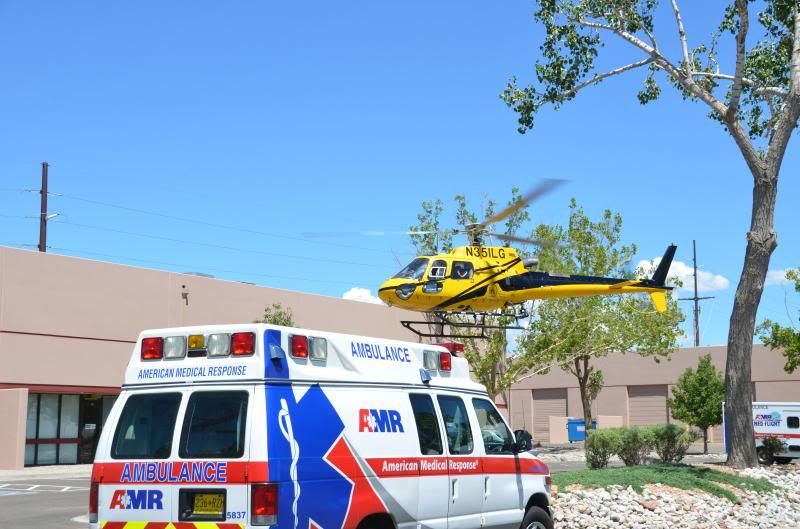
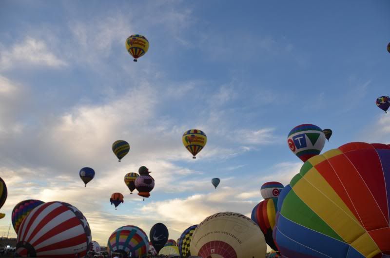

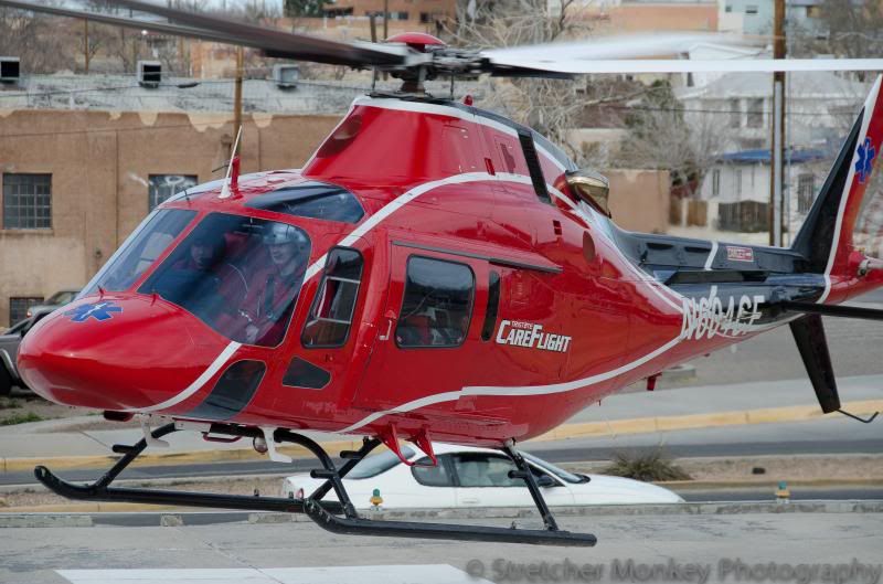
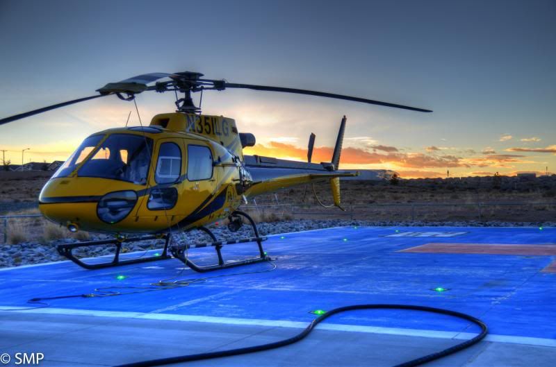
And my FB page for my photography is updated a little more regularly than my main page....
https://www.facebook.com/Stretchermonkeyphoto


cruisertoy
Explorer
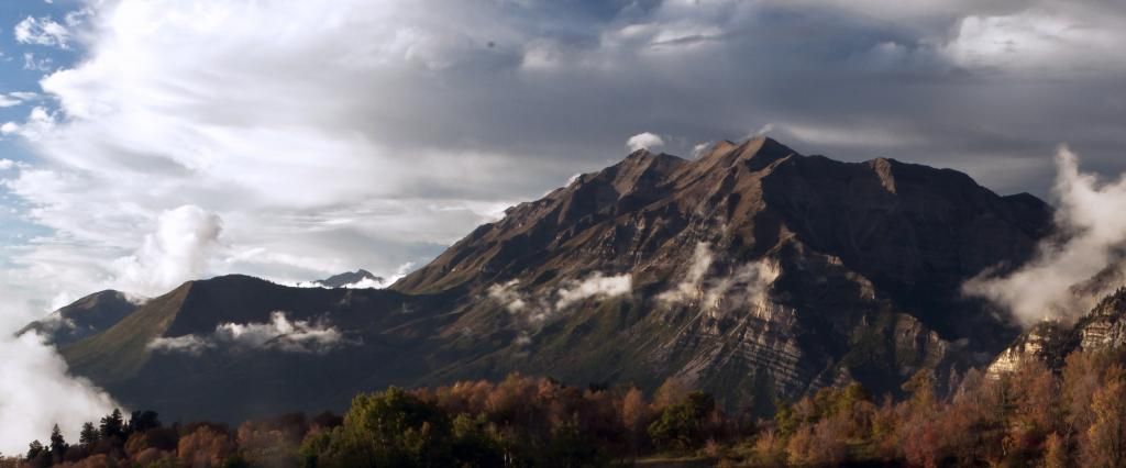
We had a good rain storm Sunday afternoon so I took the family up the hill to see if I could catch a few crisp clear pictures of Timp. The rain had come and gone and there were still nice low lying clouds hanging around. There seemed to be a lot of that humid Haze as well so I was a little disappointed in the clarity of the pictures I took. That and my kids decided to have a weed fight in front of the camera and somehow I got a wet spot on the lens (hazy ghosts on the lower left. Nikon D90 18-200, F22, A1/60, 35mm, iso 800 with a UV filter. I shot from a tripod on a timer.

nwoods
Expedition Leader
Cruiser, that's a good shot. Great exposure with great low tones and no real blowouts. Also, good job on using the Rule of Thirds, keeping the peak off center. I think this would have been a bit more dramatic towards the evening in the setting sun (assuming West is to the left), but otherwise this is a very solid shot. Would probably look great blown up poster size.
Similar threads
- Replies
- 0
- Views
- 673
- Replies
- 67
- Views
- 16K
- Replies
- 9
- Views
- 3K


