Lost Canadian
Expedition Leader
Peruvian Andes Revisited
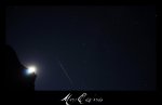
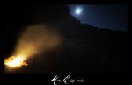
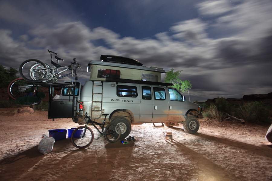
I'm still in the process of reprocessing most of my pictures with the latest software, namely LR3. Here are a few from the Andes.


I'm still in the process of reprocessing most of my pictures with the latest software, namely LR3. Here are a few from the Andes.
Last edited: