Lost Canadian
Expedition Leader
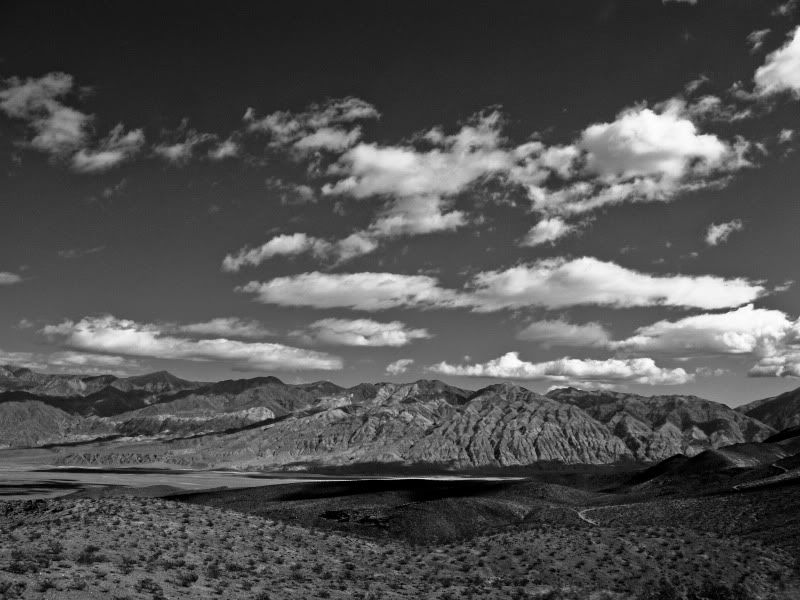
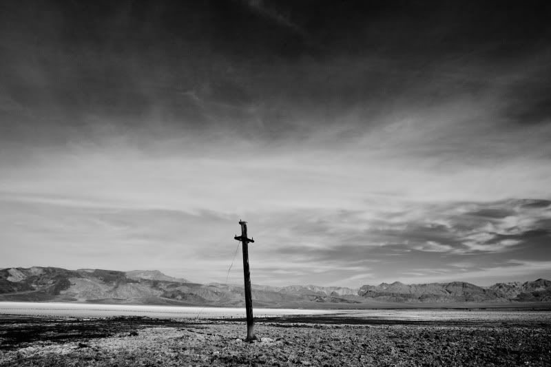
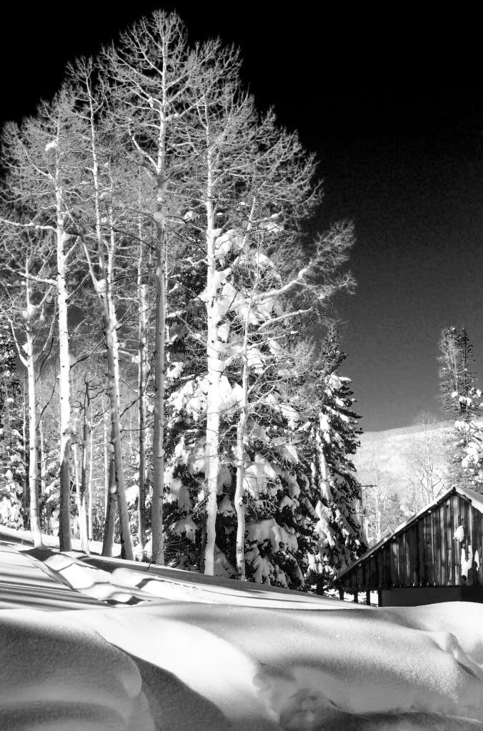
Just remember that the eye goes to the lightest area of a photograph. And can tend to stay there.
I strongly believe in "negative" space in a print, but the "negative" space needs to have balance in itself, as well as in the whole image.
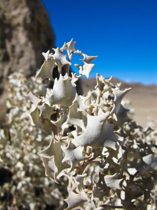
I like the sky in the seventh image.
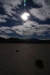
My intention, at least with the process, was to push the nonlinear perspective of these a bit to create some depth. By brightening up the sky/clouds/fog, it brought the darker elements forward, which I felt was a good thing as they are the focus. Another thing was that even with the clouds toned down they were still the brightest part of the picture by a fair margin, and one problem I was having with them in their toned down state was their form and texture seemed to crowd the space and was confusing a number of the scenes by imparting a mis-matched perspective of their own. Basically they were working in contrast to my intents.
Now, in all honesty I wish I could just go back to when I shot these because I've learned quite a bit since then, but I won't be going back any time soon so I'm making due with what I have. That said, I still like them for memory sake, and it has been a bit of a battle to figure out what works best with these shots, thankfully I think I'm finally content.
I really appreciate all the comments, it's refreshing when talk about the decision process that goes into making our pictures.