It is always rewarding to work hard on a photograph, to get it just the way you want it. One way to eliminate people from public places, is to use very long shutter times. People are never in one place long enough to register in the image. You might have to use some dark, neutral density filters, and a small aperture, to keep from over exposing the image. It also gives you time to use a flash, to brighten the areas and draw the viewer's attention. Take a few shots at normal speeds and apertures, working with the composition, until you find something strong, then set up there, for the long exposure.
Rules: The viewer's eye is drawn to the brightest part of an image first, or the area of highest contrast.
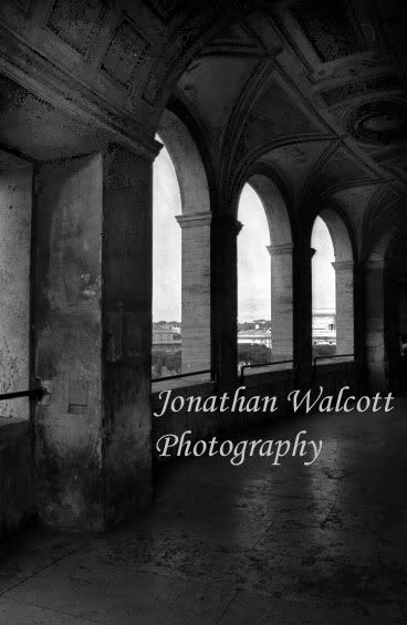
This image draws us through the arches and out the other side. I would like to see more light, up into the ceileng. If you shot this in RAW format, you can make two images; one to bring down the background exposure, and one to bring up the architecture exposure. Bring the two images together, into one photograph, having two layers, with the properly exposed architecture on top. Using a mask, you can cut out the over exposed arch-openings, revealing the properly exposed openings in the layer below. This allows you to create an image, that looks the way your eyes saw it.
As composition goes, try a few things. It would be worth trying a shot, from a little lower angle, looking more upward. This would show less walkway, and more ceiling. This may or may not make a better image; but it is always worth trying. The proportions of this image feel good, not too much of anything, except maybe the floor. The arches shrink into the distance; but they run through the center of the image. Higher or lower might feel better. Again, worth a try. You may try cropping this image, and see how you can change the composition and feel of the image.
toyota_jon said:
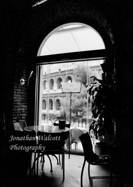
It took me FOREVER to take this pic, as people were constantly walking by
Try this again, during a time of day or a time of year, when the light is not so bright, outside. This will lower the dynamic range of the image, and allow you to have a little more detail inside, and not as bright outside.
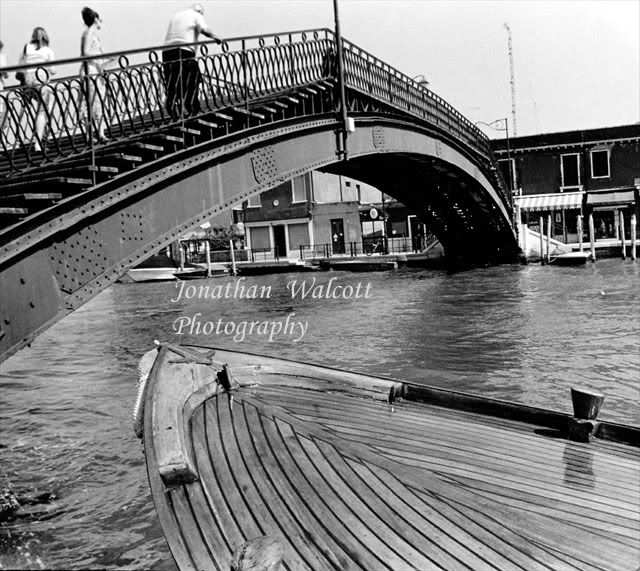
this one the exposure was really bad, and it took me hours to get it to this point, i'm not happy with it but i like the framing
The lines and form are interesting. Plenty of texture on the bridge structure, and the wooden boat. Again the proportions feel good. The bridge taking a 1/3 and the boat taking a 1/3 of the image space.
Crop to level up the water (make the light pole in the middle of the bridge vertical); it feels like the water is running off the left side of the image. This might keep it from feeling like the boat is about to crash into the bridge also. Exposure is good, focus is good, human interest is good.
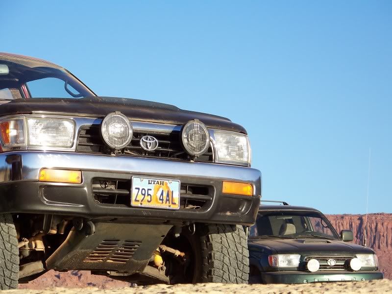
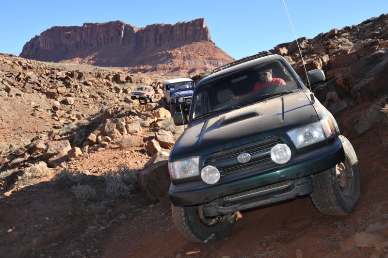
This is one of my very favorite pictures i've taken
tell me what you guys think!
Try a couple of these ideas, and see what you think of the results.

