Get your tickets to THE BIG THING 2026!
You are using an out of date browser. It may not display this or other websites correctly.
You should upgrade or use an alternative browser.
You should upgrade or use an alternative browser.
Photo Critiqing Thread
- Thread starter GaryMc
- Start date
I shot this one last week in Wyoming while branding some calves. I like the photo, just wondering if there's a way to improve on something like this.
Canon T1i
16-35mm 1:28 L
Cheers,
Bobby
I like it. Good focal point. I agree about cropping the half-head out.
Photog
Explorer
OK. Interesting "Frog's Eye" view. It looks like an interesting area to photograph. I can't really tell what drew you to take this photo.
Problems: Flat light, reducing texture and color. This could be improved with different weather or time of day. It could also be improved by using Photoshop to increase contrast and saturation.
I like the large rock formation on the right. I would crop this image into a vertical, using that rock formation as the subject of the photograph.
Try it again, if you have easy access to this area. There is a lot to work with.
Any and all feedback would be welcomed, harsh or not.
Thanks,
Brian

Last edited:
Every Miles A Memory
Expedition Leader
That would be a cool background photo to use as behind a company name or something...
Every Miles A Memory
Expedition Leader
It is....

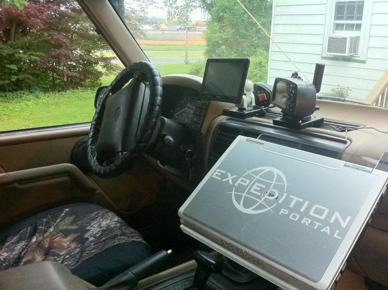
Lets have a contest to see how many electronic gizmo's one can put on their dashboard to keep them from paying attention to where they're driving...LOL
photoman
Explorer
I'll provide my thoughts on these three shots of yours.
There is something here but there are too many distractions. I really wish this shot was just the man sitting with the girl looking over his shoulder. The problem is there are other people in the art work and they are now headless or missing half of their face which makes it visually distracting. Other distractions are the grocery bags, the bright area to the bottom left of the table, and due to the table and cut in the concrete the image appears to be tilted to the right. While the only thing you could control was the crop and framing of the image you must be aware of all the other pieces of the image. This is why street photography is one of the toughest to get right.
I like architecture, simplicity, shapes, and textures so I see some potential in this image. My suggestion is to do a high contrast black and white conversion to give it a bit more drama and abstract feel.
This is a great example of leading lines with the tracks leading to the back of the image. Two things working against you here is that the left and right side are unbalanced with the right side overpowering the left and the lighting is pretty bland. If you could retake this at sunset or sunrise when there is some nice golden light reflecting in those windows it would give this image a much more dynamic feel.
All have potential. Nice work.
.I thought I would dip my toe into the waters of the critique thread. Let me know what criticism/advice you have on a couple shots I took this weekend in LA:

There is something here but there are too many distractions. I really wish this shot was just the man sitting with the girl looking over his shoulder. The problem is there are other people in the art work and they are now headless or missing half of their face which makes it visually distracting. Other distractions are the grocery bags, the bright area to the bottom left of the table, and due to the table and cut in the concrete the image appears to be tilted to the right. While the only thing you could control was the crop and framing of the image you must be aware of all the other pieces of the image. This is why street photography is one of the toughest to get right.
.
I like architecture, simplicity, shapes, and textures so I see some potential in this image. My suggestion is to do a high contrast black and white conversion to give it a bit more drama and abstract feel.
This is a great example of leading lines with the tracks leading to the back of the image. Two things working against you here is that the left and right side are unbalanced with the right side overpowering the left and the lighting is pretty bland. If you could retake this at sunset or sunrise when there is some nice golden light reflecting in those windows it would give this image a much more dynamic feel.
All have potential. Nice work.
All have potential. Nice work.
I agree completely with all of your critics.
I've been trying my hand at street photography when I get a chance. It is the single most challenging type of photography I have encountered... and have only had two or three shots that were worth a damn.
Here are a couple...


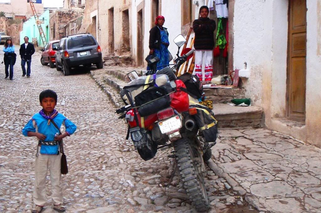
I'll critic my own picture above, because I'm ashamed of myself for not getting a better pic. Mind you the photo quality is due to using a simple canon P&S that I keep in the chest pocket of my moto jacket.
The distractions in the photo, the people walking down the street... had I waited another 15 seconds they would have been passed the frame. I also just point and shot from a standing level. It would have been much better had I move a little to the left and knelt down showing more of the architecture and his parents. Would have been even better had the cars not been in the background.
But, on the flip side, there is a human aspect to street photos. It would have been very difficult to get any different of a photo. The dad became upset when I snapped the above pic. He didn't ask for money, but wasn't happy that I didn't ask permission first.
Think. Frame. Shoot.
XJBANKER
Explorer
So this photo I was trying to get as quick as I could before the butterfly flew away. I have one that works really well as a portrit shot but this one feels more in the moment that I like. I was going to angle more from the right but I could see Up her dress and from the left did not catch her face. If I would have known the Butterfly would stay with us for six days I would have spent more time with it, but who know it would turn into a pet for that long. Sot with Canon 40d 50mm lens. The only editing that I did was making it Vibrant on my phone since my computer sucks and I don't have any editing software at the time.


Tucson T4R
Expedition Leader
I actually like the photo before the phone edit more. If you have Lightroom or something I would just add some contrast and a bit of sharpening. The phone edit ended up darkening her face a bit too much. If you push the image in that direction I would locally up the exposure on her face to keep it balanced.
Bottom line...Sweet shot. :victory:
Bottom line...Sweet shot. :victory:
XJBANKER
Explorer
Thank you for the compliment. I have never entered a photo competition before other than posting things here for give aways or something like that. After we kept the butterfly for 6 days it died and I mounted it in a frame with this photo. I was sad that her face was a little messy from eating cake right before from a birthday party, but used the time that I had. We just used a 5x7 photo and the other photo I have as my wallpaper on my computer at work for now. I dont have any editing software, my computer took a dump so the only editing I can do is with a photoshop app on my EVO.


Last edited:
cbradley
Adventurer
Photoman,
Thank you for the comments; I really appreciate the input. My apologies for not thanking you earlier, a post I wrote on my iPhone in tapatalk apparently didn't actually post. I've been working on the photos in response to your comments. Photo 1 was able to be improved somewhat, but still has many of the drawbacks you noted. Photo 2 is getting there, but needs more burning and photo 3 will need to be reshot, like you mentioned. I'm hoping to head back out there next weekend, so we will see. I'll repost once I'm happy with the edits.
Thank you for the comments; I really appreciate the input. My apologies for not thanking you earlier, a post I wrote on my iPhone in tapatalk apparently didn't actually post. I've been working on the photos in response to your comments. Photo 1 was able to be improved somewhat, but still has many of the drawbacks you noted. Photo 2 is getting there, but needs more burning and photo 3 will need to be reshot, like you mentioned. I'm hoping to head back out there next weekend, so we will see. I'll repost once I'm happy with the edits.
I'll provide my thoughts on these three shots of yours.
.
There is something here but there are too many distractions. I really wish this shot was just the man sitting with the girl looking over his shoulder. The problem is there are other people in the art work and they are now headless or missing half of their face which makes it visually distracting. Other distractions are the grocery bags, the bright area to the bottom left of the table, and due to the table and cut in the concrete the image appears to be tilted to the right. While the only thing you could control was the crop and framing of the image you must be aware of all the other pieces of the image. This is why street photography is one of the toughest to get right.
.
I like architecture, simplicity, shapes, and textures so I see some potential in this image. My suggestion is to do a high contrast black and white conversion to give it a bit more drama and abstract feel.
This is a great example of leading lines with the tracks leading to the back of the image. Two things working against you here is that the left and right side are unbalanced with the right side overpowering the left and the lighting is pretty bland. If you could retake this at sunset or sunrise when there is some nice golden light reflecting in those windows it would give this image a much more dynamic feel.
All have potential. Nice work.
Similar threads
- Replies
- 0
- Views
- 675
- Replies
- 67
- Views
- 16K
- Replies
- 9
- Views
- 3K


