Get your tickets to THE BIG THING 2026!
You are using an out of date browser. It may not display this or other websites correctly.
You should upgrade or use an alternative browser.
You should upgrade or use an alternative browser.
Photo Critiqing Thread
- Thread starter GaryMc
- Start date
Box Rocket
Well-known member
Thanks-
All my shots are processed one at a time. Some are simply some minor adjustments in Lightroom2 or Iphoto and then uploaded. Others get a little more treatment in PS but I am still a beginner in that program.
This one in particular was an HDR. 3 exposures from very dark to rocks exposed correctly. These were taken before sunrise in October of 2008. I usually do not take HDR to this extreme- preferring a more natural look but I felt it worked in this instance. The one thing I still do not like about this image is the clouds - the HDR programs make the sky a little strong for my taste and my usual style.
Any more questions just let me know.
Thanks. I need to try some HDR again. Don't use it very often, but I should. Also, thanks for the PM, I appreciate it.
XJBANKER
Explorer
Wow that looks a lot better. Anyway you can do it without the elk? Even though it makes the picture that much more unique.
fishy97t100
New member
Stan the Man
Adventurer
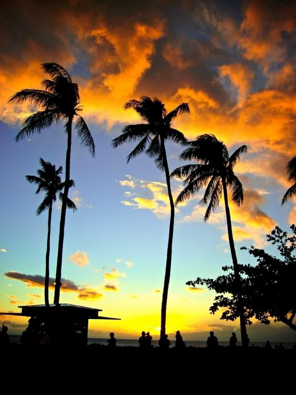
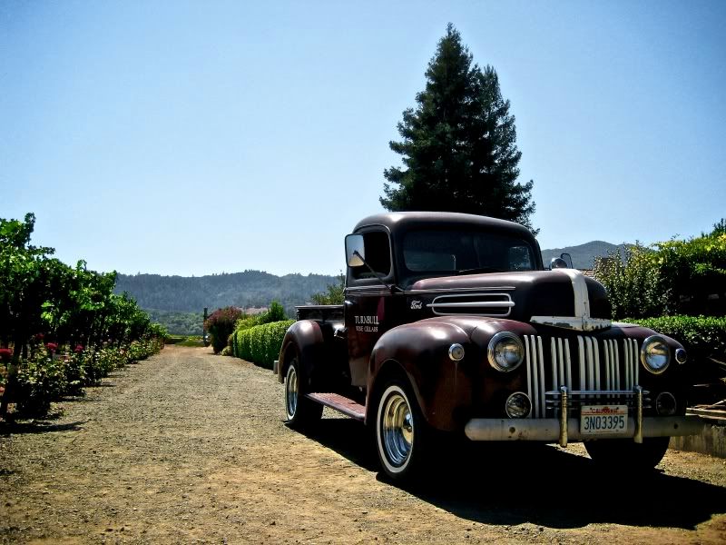
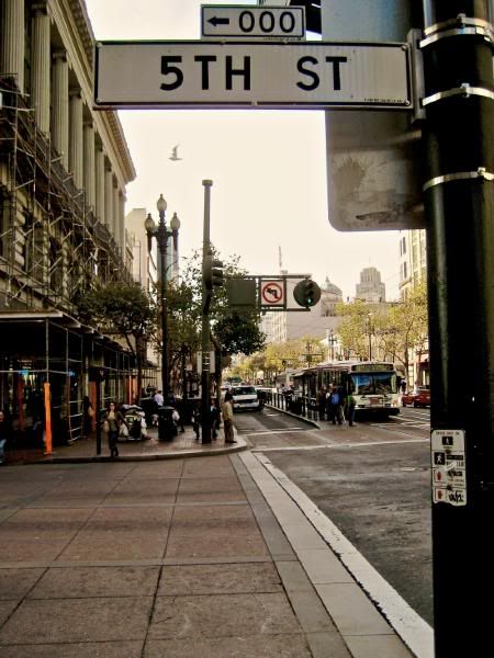
I'll give this a go. What do you guys think? I'll throw a little bit of everything out there. :sombrero:


nwoods
Expedition Leader
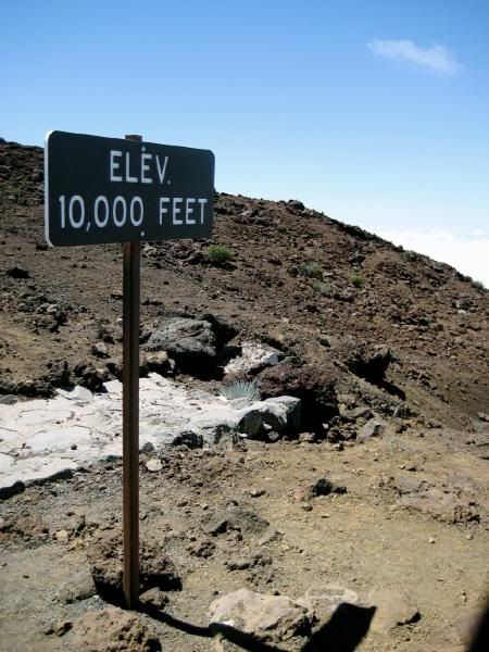
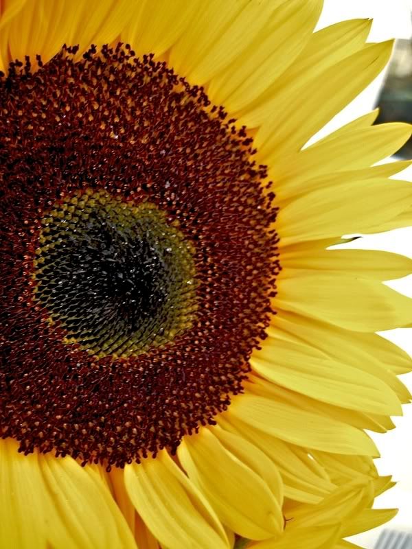
Stan, your first two did not "grab" me. I think the first one shows too much hill in the background, you don't get the impression that 10,000 feet is top of the world, nor is there much in the image to relate to. The sunflower shot has the sun on the wrong side of the flower 
The other three are really good though. Particularly the old truck photo.
The other three are really good though. Particularly the old truck photo.
Photog
Explorer
Stan, your first two did not "grab" me. I think the first one shows too much hill in the background, you don't get the impression that 10,000 feet is top of the world, nor is there much in the image to relate to. The sunflower shot has the sun on the wrong side of the flower
The other three are really good though. Particularly the old truck photo.
I agree. The 10,000 foot marker looks more like a waypoint on the way to a higher elevation.
The sunflower has no light on it. There is something bright in the background. The composition is good. If you have access to that flower, try it again with light shining through the flower from behind, and use something to block out the bright background.
The other three images are nice. I like the truck best. The people silhouettes in the sunset are a distraction for me, but they do tell a story of people watching the sunset.
Photog
Explorer
Adam,
I like the drama you have created in this image. Excellent light and exposure. I would like to see a little more space in front of the rig, and a little less in the back. The rear tire from the Quad, does not add anything to the image.
This really grabs your attention. Nice work.
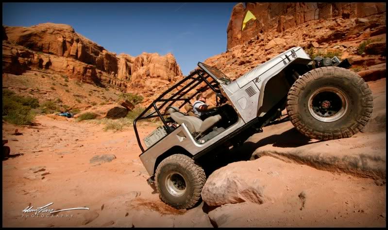
I like the drama you have created in this image. Excellent light and exposure. I would like to see a little more space in front of the rig, and a little less in the back. The rear tire from the Quad, does not add anything to the image.
This really grabs your attention. Nice work.

Photog
Explorer
XJBANKER,
I think your angles are good, on these two images.
The dramatic side-shot of a rig can do one of two things.
1) Emphasize some part of the rig.
2) Show your rig in some exciting location.
When taking this type of image, think of those two opportunities to tell a story.
This one looks like an add for the trailer company, emphasizing the trailer being towed into the high mountains. If you wanted to draw attention to the Jeep, you could move forward and cut the trailer from the view, or shoot from a frontal angle, looking back along the Jeep & trailer.
The background is a BIG deal. You have a good background in this image, and good light and exposure.
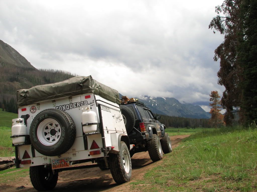
If you have seen some images like this that you really like, print a quick copy (inkjet on plain paper), and try to create an image that mimics the one you like. You will learn how to position the rig relative to the background, where to position the camera, what lens you need, depth of field to have everything in focus, and what time of day for the light you need. It is a great self assignment.
I think your angles are good, on these two images.
The dramatic side-shot of a rig can do one of two things.
1) Emphasize some part of the rig.
2) Show your rig in some exciting location.
When taking this type of image, think of those two opportunities to tell a story.
This one looks like an add for the trailer company, emphasizing the trailer being towed into the high mountains. If you wanted to draw attention to the Jeep, you could move forward and cut the trailer from the view, or shoot from a frontal angle, looking back along the Jeep & trailer.
The background is a BIG deal. You have a good background in this image, and good light and exposure.

If you have seen some images like this that you really like, print a quick copy (inkjet on plain paper), and try to create an image that mimics the one you like. You will learn how to position the rig relative to the background, where to position the camera, what lens you need, depth of field to have everything in focus, and what time of day for the light you need. It is a great self assignment.
Photog
Explorer
As always, thanks for any input.
Josh,
These are all well done images (post #343)
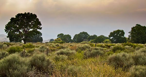
1) The lighting in this image is nice and soft. It helps the plans look soft and inviting.
The colors stand out well.
The fence is a distraction from the scene.
If the fence is a key element, move in on it and make it larger. Have it move through the photograph from near to far, at an angle, like the 3rd image below.
It looks like you used a split-density filter, to even oout hte brightness in the sky. If so, you did well. The only place you can see it is in the tree, and the color of the filter does not look to be "neutral". It looks a little golden.
The tree is also well positioned in the image. It becomes a subject, but lets your eye move around to the right side of it.
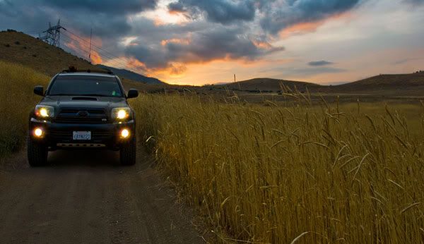
2) The lighting here is also very nice.
It is a little difficult to tell what the subject is (rig or sunset). THe sunset is brightest, but the rig is closest and positioned better.
The only distraction is the power lines.
I like the way the grassy edge of the road leads your eye back to the rig.
The headlights draw your attention to the rig, but it subconsiously makes you want to squint, like looking at a picture of someone arc-welding. It is a weird response, since the computer screen is not as bright as either light source.
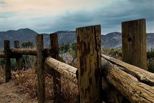
3) I really like the wooden fence.
Nice depth-of-field (focus near and far).
Good exposure.
The composition, with the fence leading you through the image works very well.
The only issue I see, is the fence cutting through the skyline of the mountains. Many people find it more pleasing to have the mountain tops be just above the subject. Bring the camera up, just a few inches and the top of the fence posts woud be below the skyline. Some instructors call these problems "intersections" or "intersecting lines". Your eye can't follow the flow of either subject.
Last edited:
HB 4X4
Adventurer
Photog
Explorer
I will. Can't do it from work computer.
Clark White
Explorer
I went on a recent camping trip and took some landscape pictures. I'm trying something new (I am NOT a computer person, so this is crazy stuff for me), taking multiple pictures with different exposures and combining them to get one better picture out of it.
The cloud exposure:
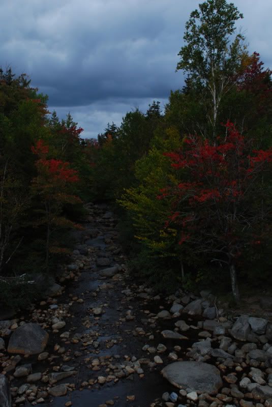
The trees exposure:
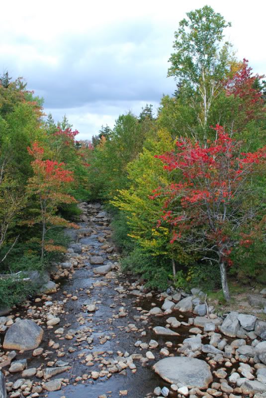
And the final product:
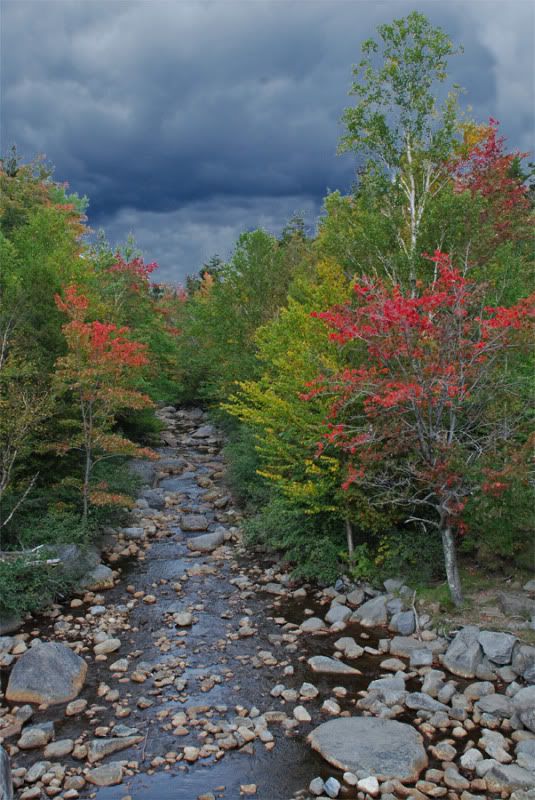
I don't quite like it, I think the trees don't quite look right, but before I spend even more hours messing with that, I figured I would post up and see what suggestions everyone might have on how to make it all fit better and look like a non-photoshoped image.
Thanks!
Clark
The cloud exposure:

The trees exposure:

And the final product:

I don't quite like it, I think the trees don't quite look right, but before I spend even more hours messing with that, I figured I would post up and see what suggestions everyone might have on how to make it all fit better and look like a non-photoshoped image.
Thanks!
Clark
Last edited:
Similar threads
- Replies
- 0
- Views
- 677
- Replies
- 67
- Views
- 16K
- Replies
- 9
- Views
- 3K
Forum statistics
Members online
- NCMODELA1
- gnel
- g_m
- Pierre D
- blupaddler
- Wrathchild
- Somecallmetimm
- superbuickguy
- wickychicky
- mmth_ski_bum
- Obsessed2findARuggedHybid
- Sabey
- unsung
- MustacheMoto
- Thuong Nguyen
- mark5280
- Long Rifle
- CORunner
- kai38
- chris the ogre
- coguzzi
- ABBB
- Flyin Squirrel
- bjorn240
- Roaming Robertsons
- Phil Meredith
- heliloo
- Cstephens81
- The Swiss
- Mekcanix
- ultragoat
- Ferjablito
Total: 4,164 (members: 38, guests: 4,126)

