Photo Critiqing Thread

Photog

Explorer
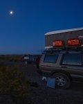
Can you please critique this one? I am a toatl beginner to the whole digital thing and struggling tremendously.....but here is what i think is a decent picture
514298784_BMizS-M.jpg


http://jwbmgallery.smugmug.com/photos/514298784_BMizS-S.jpg

Try cropping off the left half of the image. THe subject seems to be the vehicles and the moon. The rest of the image does not add anything. Bring up the exposure a little, so we can see a bit more detail. Then we will go from there.:)
 

Photog

Explorer
Trying to figure out my Sigma 30mm 1.4, I took some pics of my fiance Shan. So what do you guys think? How can I improve these?

3601714092_5403d84dac_b.jpg

That lens is working well for you. It does not seem to distort the subject, even as close as you are. But, a 30mm lens forces you to get very close, and that can be very intimidating to her. A longer lens and a couple steps back will let her relax, and it will show on her face.:)

On all of these, crop a bit off the left side. Most of the image is a brick wall. In a close portrait like this, you want most of the image to be the subject. Crop them to 8x10 format, removing all the excess from the left edge.

Her eyes don't seem to looke in the same direction. Work with her to find an angle that will diminish this appearance. Shots #1 & #2 do this in two different ways.

The light is vey flat, and does not give her face any shape or shadow. Have somthing large and white at camera-left, to add some extra light from one side and slightly above her face.

Try the shots again, and consider a vertical composition, that includes a little more of her and a little less brick. Then vignette her with Photoshop.

Great start. Keep working at it. Good portraits are not easy.
 

nwoods

Expedition Leader
Clark, I really like #2. You've captured great detail in her right eye. I agree with photog, some off camera side-lighting would be great.
 

Ryanmb21

Expedition Leader
Thanks guys, I really like your edits. I will use your advice next go around. Great advise.

cheers!
 

Photog

Explorer
Josh (HB4X4),
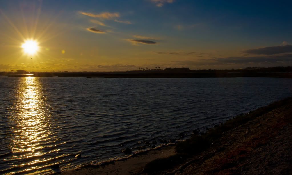
Here is a critique of my favorite in the group.
20090606-DSC_0110-1.jpg


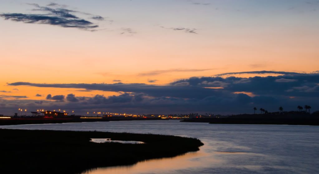
Nice use of the light, reflections and silhouettes.

The water curves around and leads the viewer back into the image. The silhouette in the foreground does not block the way into the image (good).

Good fore, mid and background.

The lights lead off in the same direction as the waterway, as another subject leading the viewer back into the image.

The clouds worked out well, as their shape copies that of the silhouette in the water.

Overall composition and exposure is good: horizion line near the rule of thirds (always a good place to start; but a good rule to break also).

Try cropping the right side off, such that the silhouette projects across 2/3 of the image. Also, try cropping the top off, to eliminate the extra cloud at top left. I don't think the top crop will make the image better; but it does make the image feel different.


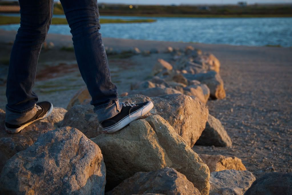
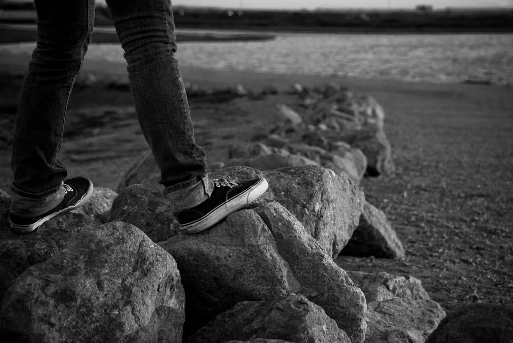
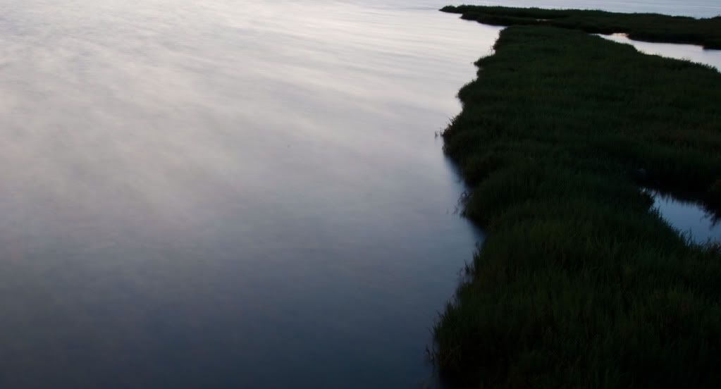
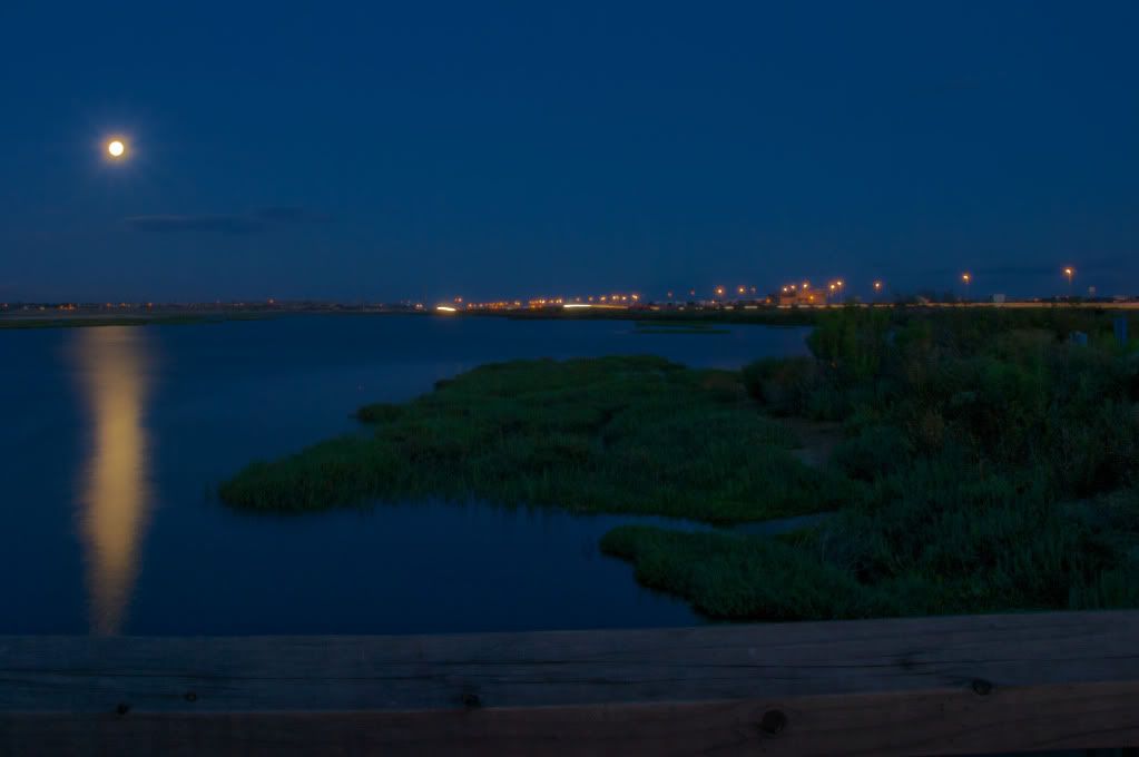
The rest of the images are interesting (fewer images make it easier to do a critique. :))

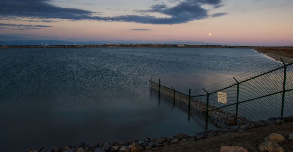
#3
The fence in the water has perfect composition. Try moving in closer to the fence to see if you can make an image that give a "desperate" feeling.

#4
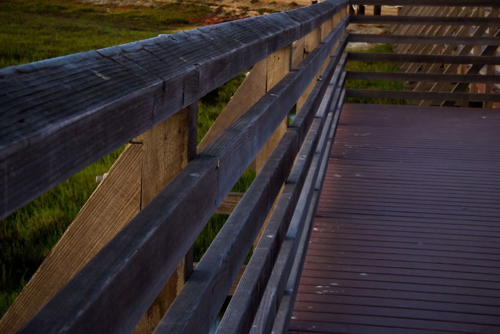
The evening light is great to work with (morning light on east coast). I like the soft colors in the hand railing image, and all the various crossing lines. Rotate/crop to make the vertical posts in the middle, vertical.
 

nwoods

Expedition Leader
I agree, to me it is the one with the most visual mystery and appeal. It makes you want to look at it.
 

Photog

Explorer
Josh,
I have not been ignoring you. Just have not had enough time to do a proper critique. I will.

Check out these podcasts from Bruce Percy's website. Trevor (Lost Canadian - or is that Scottsman?) pointed these out. Bruce has an excellent vision for the images he creates. Definitely something to strive for.
 

Forum statistics

Threads
188,343
Messages
2,905,832
Members
229,959
Latest member
bdpkauai
Top