Josh (HB4X4),
Lets number the images 1,2,3 & 4, starting at the top.
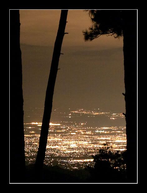
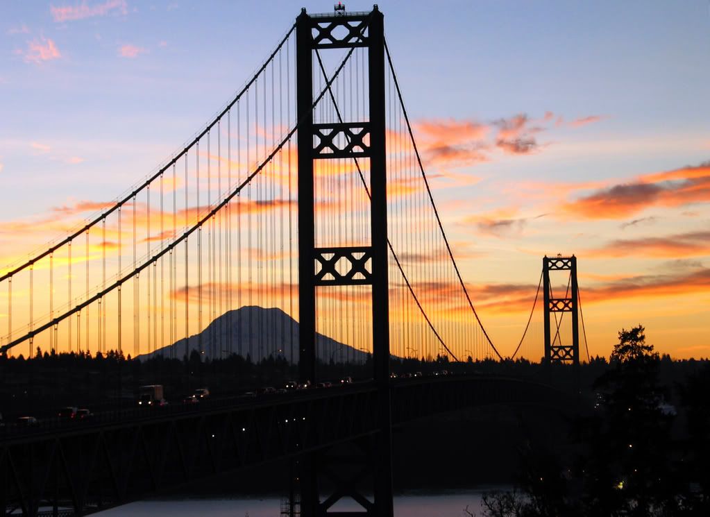
#1 & #2 - This is a personal thing; but I can't stand sunset/sunrise images. There must be 3 billion of these out there. Sunset/sunrise colors work great as a backdrop for a great silhouette, or as the main light for a subject. Trevor (Lost Canadian) has done some very nice work with morning & evening light. Check out some of his work in earlier posts in this (Critique) thread, and in other threads. Here is an example from my area (Tacoma Narrows Bridge, with Mt. Rainier, at sunrise). This shot was figured out 6 months earlier, and was waiting for the right sunrise colors:
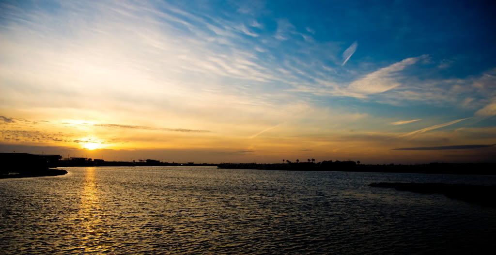
#1 - With the sunset as the subject, the composition is done well. The horizon line is at the rule of thirds, and the sun-spot is also near the rule of thirds. This allows the play & drama in the clouds to rise up and across the image. The sun-streak in the water is nice, but the shoreline on the right side is broken and does not help to lead the eye over to the sun-spot. This would be a good spot to re-visit, and see if you can find the best composition of shoreline, etc., then return again when the sunset is screaming, and get that perfect shot (for those that like sunsets
")
)
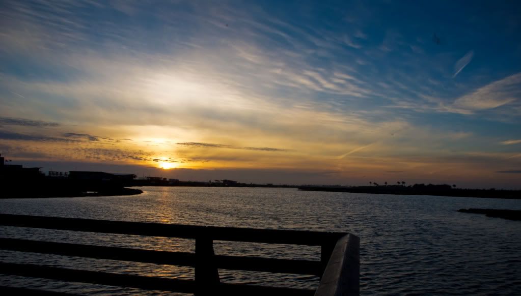
#2 - the handrail in the foreground is a distraction from the sunset (subject). When using the technique of having an object in the foreground, make it your subject, allowing the background to show where the subject is located.
Galen Rowell and others have done well with this technique.
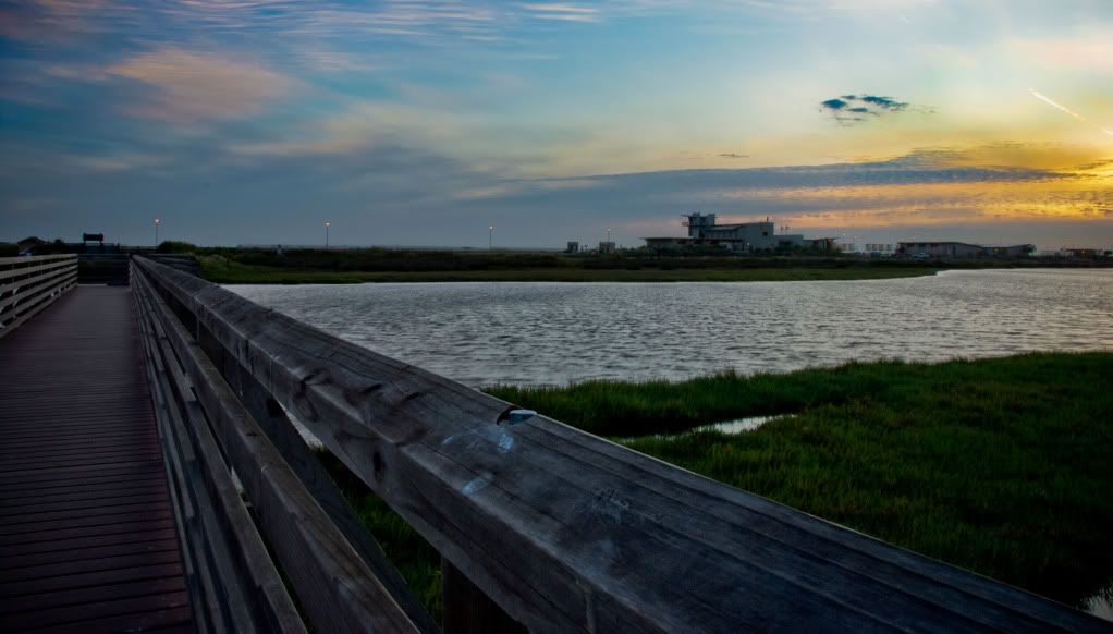
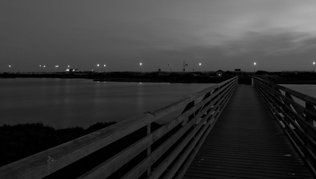
#3 & #4 - I like these much better than #1 & #2. I think the shutter speed listed for these images is backwards. The longer shutter speed (30 sec) will make the water softer, and the shorter (.6 sec) will maintain the visual of the waves on the water. They both have leading lines, that draw the viewer into the image. Try not to have the leading line come directly from the corner (#4). #3 works because the handrail is so large in the corner.
#3 - I like the soft colors and soft light in this image. The heavy handrail with the hard edges is a nice contrast to all the softness in the image. Good composition. Maybe a little less of the bright sky on the right. The bright area is drawing the viewer's eye away from the rest of the image. If the building is important, make it larger in the image (24mm instead of 18mm lens).
#4 - The walkway leads to the shore and the lights make another trail for the eye to follow; but they don't connect together. The viewer may feel like there are two paths for the eye to follow. See if you can get this shot again, from an angle that will feel like the walkway connects to the trail of lights. Maybe get higher, or shoot from a different position on the walkway, etc.
Finally - See if you can clean the sensor or have it cleaned. There are dust spots on your images.:smilies27
I am looking forward to updated versions of these images Josh.:wings: