Photo Critiqing Thread

pwc

Explorer
I like the fire truck but next time see if you can get that large light behind it and still get detail out of the truck. it's a bit of a distraction how it sits right now.
If you want to have some more fun with night shots, do what you did and use a large/wide beam flashlight and 'paint' the object. it's a lot of fun and get great results. Here's an example with two headlamps used to paint the trucks, while setting the shutter to capture the stars accurately. Kinda. :)
050729-232621-5223_std.jpg
 

Photog

Explorer
7wt said:
I have been a very busy boy as of late. I have been having a hard time with helicopters because of the shutter speed being too fast and stopping the rotors. Well I finally got a decent shot with some rotor blur.
AStar.jpg

Ever since I got a tripod I have been messing around with night stuff and last night's fog was just too good.
Fox2.jpg


Caravan.jpg


I may not get the best shots but I certainly have some of the best subjects!

I am happy to see you are working to obtain a certain effect, such as the blur in the rotor blades. Once you determine the shutter speed that does a good job with that, use your "Shutter Priority" at that speed setting, and let the aperture follow automatically. Then you can concentrate on the composition and lighting. This was a good piece of the puzzle to figure out.

I really like the float plane in the fog. Fair back lighting. It has a little bit of the same problem as the Fire-truck, with the distracting lights. They are not as bad in the airplane shot.

The Fire-truck looks really good, except for the bright light. If you could have moved to the left, or waited for the truck to move to the right, that big light would be blocked, and the exposure would have been better, and the photo could be better. It looks like it might have been the headlights of another vehicle, as I see two reftions of light, on the ground. One of the lights is being blocked already. I also like the multiple colors of light. A little more work, and you will have a nice photograph to present to the Fire Dept.
 

Photog

Explorer
pwc said:
I like the fire truck but next time see if you can get that large light behind it and still get detail out of the truck. it's a bit of a distraction how it sits right now.
If you want to have some more fun with night shots, do what you did and use a large/wide beam flashlight and 'paint' the object. it's a lot of fun and get great results. Here's an example with two headlamps used to paint the trucks, while setting the shutter to capture the stars accurately. Kinda. :)
050729-232621-5223_std.jpg

These are fun to play with, and difficult to do well. When it comes together, these types of images look really great.

I have not spent much time creating images like this; but the nice work I have seen, was even more controlled than this. Light was painted onto only the subjects, and nothing else. They even added more/less light, to create shading.

With your image as an example, they would have painted more light onto the vehicles, and less onto the grass.

I can only remember one of the photographer's names: Art Wolfe. There are others, that are even better.

It is cool that you are thinking of this, and trying it.:26_7_2:
 
Last edited:

pwc

Explorer
I agree, less lighting of the grass would have been better. but this was a last minute idea and the best I could do with the drunkards helping me. :)
 

Photog

Explorer
pwc said:
I agree, less lighting of the grass would have been better. but this was a last minute idea and the best I could do with the drunkards helping me. :)

Good help can be hard to find. Even harder after an evening around the campfire.;):friday::1888fbbd:
 

7wt

Expedition Leader
Photog said:
I am happy to see you are working to obtain a certain effect, such as the blur in the rotor blades. Once you determine the shutter speed that does a good job with that, use your "Shutter Priority" at that speed setting, and let the aperture follow automatically. Then you can concentrate on the composition and lighting. This was a good piece of the puzzle to figure out.

I really like the float plane in the fog. Fair back lighting. It has a little bit of the same problem as the Fire-truck, with the distracting lights. They are not as bad in the airplane shot.

The Fire-truck looks really good, except for the bright light. If you could have moved to the left, or waited for the truck to move to the right, that big light would be blocked, and the exposure would have been better, and the photo could be better. It looks like it might have been the headlights of another vehicle, as I see two reftions of light, on the ground. One of the lights is being blocked already. I also like the multiple colors of light. A little more work, and you will have a nice photograph to present to the Fire Dept.

Present to the fire department? I am the fire department! In retrospect, I should have moved the truck a little. I was just so gosh darn tired after a long day. I only stayed around late because of the fog. On first blush I liked how the bright light left a blue hue that transitions over to the yellow from the parking lot. The transition happens over the Oshkosh.

Good tip on the shutter priority setting, I didn't think of that. I took the A-Star on manual and was pretty glad I got the aperature right. I was a little bummed when he left, he went straight out. When the dude came in, he banked it over about 15 degrees close to 10 feet off the ground. What a sight. One thing is for sure, this photography thing is a great hobby. I am having more fun with it than almost anything else right now.
 

Lost Canadian

Expedition Leader
Looking for honest feedback on this little series I called "Washed Light"

What I did was, while shooting, I pushed the exposure as far right as possible, stopping just short of clipping. Most shots were taken around F11, I had started shooting at F18-22 but noticed that my sensor was filthy, and I didn't want to spend forever spot cleaning, so I just opened the aperture. Anyway, then in Lightroom 2, which is awesome by the way, I desaturated, sharpened, and added just a touch of vignetteing to a few of the photos.

My goal here was to give the photo's a light airy feel.

Let me know what you think, thanks in advance.:)
 

Photog

Explorer
Lost Canadian said:
Looking for honest feedback on this little series I called "Washed Light"

What I did was, while shooting, I pushed the exposure as far right as possible, stopping just short of clipping. Most shots were taken around F11, I had started shooting at F18-22 but noticed that my sensor was filthy, and I didn't want to spend forever spot cleaning, so I just opened the aperture. Anyway, then in Lightroom 2, which is awesome by the way, I desaturated, sharpened, and added just a touch of vignetteing to a few of the photos.

My goal here was to give the photo's a light airy feel.

Let me know what you think, thanks in advance.:)

Trevor,
That is a nice series of images. I can see you worked on various compositions for each subject. And you probably noticed they didn't all work. You got close for detail images, and backed up for some wide angle views too. And my favorite, the Near - Far images. This is a good approach to working an area or subject. Your over-exposure method works well with this subject, because it is basicly white. White subjects need to be pushed to the upper exposures, so they don't come out grey in the image.

I wasn't able to pull any images out of the slideshow, to use for discussion, and I couldn't find any file names either (probably just me missing something obvious again).:confused:

Some people are masters of the "Near - Far" images. Galen Rowell (look at image P18) was one of them. My photography has improved from studying this particular style. The key to this type of wide angle photography is: The nearest object must be the subject, allowing the background to tell you where the subject is, in the world. Many people try to take a wide angle shot of a beautiful scene, and then include something in the foreground, to create a 3D effect. It works, but isn't usually pleasing to look at. This is because the foreground was an afterthought. The foreground objects get most of your attention; so they really need to be the subject of the image. This is one of those statements that is "usually" true; but like rules, it can be broken. Check out Marc Adamus' work. Much of Marc's work creates repeating lins & shapes between the near and far portions of the images. I aspire to do landscape work like Marc Adamus.

Anyway; you have a few there, that could be printed large, and hung in some hotels. The pail tones would be very calming, and yet the details will draw the viewer in for a closer look (sharp focus is a must).:clapsmile A few more that are good examples of good composition, framing, level, light -v- dark, etc. You could take 9 of these and make a great photo study, mounted in a large frame.

Without pulling some out, that is about all the comment I can offer. The one that stands out the most to me is, the Large Icicles. As a group of images, it is a nice piece of work.
 
Last edited:

nwoods

Expedition Leader
Trevor, those are pretty cool images (pun intended). Photog, click the Grid View (upper right) then above each image (when selected and enlarged) there is a link that says, Get Links, and it opens a Flikr-esk format view.

Trevor, your images have tons of noise in them, for effect I think. What ISO did you shoot?

20080324-_DSC1677-1.jpg
 

nwoods

Expedition Leader
Photog said:
Check out Marc Adamus' work. Much of Marc's work creates repeating lins & shapes between the near and far portions of the images. I aspire to do landscape work like Marc Adamus.

OMG! Those image are so sureal, they almost look fake. They are stunning!
 

pwc

Explorer
Wow, yeah, he's got some skill.
Even better as he has images of a trip we plan to take in Oregon this summer.
 

Lost Canadian

Expedition Leader
Photog said:
Trevor,
That is a nice series of images. I can see you worked on various compositions for each subject. And you probably noticed they didn't all work. You got close for detail images, and backed up for some wide angle views too. And my favorite, the Near - Far images. This is a good approach to working an area or subject. Your over-exposure method works well with this subject, because it is basicly white. White subjects need to be pushed to the upper exposures, so they don't come out grey in the image.

Thanks for your comments Brian. Yeah not all of them work, and to be honest, personally I'm not overly impressed by any of my images, but I'm my own hardest critic so I figured I'd throw them up for review here. I wish I could have dedicated a little more time and effort to shooting the beach, but as was the case, I was just out for a walk with the dog and I had to keep one eye on her as the ice was getting thin in spots and was starting to break up. It was a chance for me to test out my new tripod and try something different with exposure though so I tried to make the most of it....

As for the links you provided, I've actually had Galen's website bookmarked for some time, he really was a master of landscape wasn't he. I have not seen Adamus's work before though, it's breathtaking, thanks a ton for that link. Definitely something to work toward.

nwoods said:
Trevor, those are pretty cool images (pun intended).

Trevor, your images have tons of noise in them, for effect I think. What ISO did you shoot?
Thanks for the comments. That's not noise, I'm not really sure what it is but I think that's Photobucket's ugly posterization, or whatever you call it, from the downsizing of original file. You can really see it in the sky with some of the shots. Digitized lines:smilies27

I shot at the base ISO, which is 100 in my camera, and the originals look good, so that's the only thing I could think of that it may be. Time to use a different site I guess.:snorkel:

Cheers
 
Last edited:

Photog

Explorer
Lost Canadian said:
Thanks for your comments Brian. Yeah not all of them work, and to be honest, personally I'm not overly impressed by any of my images, but I'm my own hardest critic so I figured I'd throw them up for review here. I wish I could have dedicated a little more time and effort to shooting the beach, but as was the case, I was just out for a walk with the dog and I had to keep one eye on her as the ice was getting thin in spots and was starting to break up. It was a chance for me to test out my new tripod and try something different with exposure though so I tried to make the most of it....

As for the links you provided, I've actually had Galen's website bookmarked for some time, he really was a master of landscape wasn't he. I have not seen Adamus's work before though, it's breathtaking, thanks a ton for that link. Definitely something to work toward.


Thanks for the comments. That's not noise, I'm not really sure what it is but I think that's Photobucket's ugly posterization, or whatever you call it, from the downsizing of original file. You can really see it in the sky with some of the shots. Digitized lines:smilies27

I shot at the base ISO, which is 100 in my camera, and the originals look good, so that's the only thing I could think of that it may be. Time to use a different site I guess.:snorkel:

Cheers

Trevor,
I know it might be difficult to return to this sceen, since it is melting away; but, consider the things you don't like about the images. Then imagine the way you would like it to have looked. Sketch it, if it helps. Return to the sceen, and be very meticulus about your composition, depth of field, and exposure.

Everyone,
Try this "re-shooting" process, with a subject you have easy access to. By going through this process, you will be able to improve the images you create, when you are in an area you can not return to, or one that is melting away.
 
Last edited:

Photog

Explorer
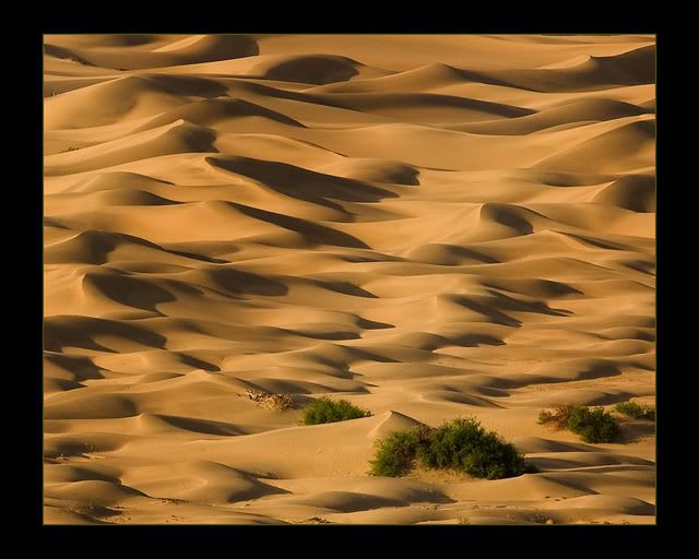
Here is a photo I took in Death Valley.
It has been critiqued by a panel of professional judges.
Last week, it earned 1st place in the Commercial-Unclassified catagory, for Professional Photographers of Washington.

The title is: Life at the Edge
IV8E0222.jpg


Notice that it is composed way off the rule-of-thirds (more like 1/5's and 1/3's).

The judges said:
It is simple yet complex (explain that?).
Sharp detail
Perfect exposure
Title matches image
Caused emotional reaction
Good impact
Blah, blah, blah.....

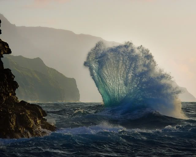
This just proves that judging can be very subjective, because I didn't like it as much as this other one I entered, which didn't even place. Go figure.

Title: Na Pali Coast #81
EPV0926Blue.jpg


Anyway, look at these, and do a critique, based on composition, light, drama, etc. You know - Tell me what you think.
 
Last edited:

Clark White

Explorer
I'd love to critique those shots, but I'm not sure I see anything that I might have done differently, and certainly nothing I could have done better. :bowdown: The shot of the wave has to be one of the best wave pictures I've ever seen. Maybe a half step lighter? That might take away some of the drama though, so I'm not totally sure that would have been a good thing. As for the dunes, I really don't think there is anything anyone might have done differently.

Clark
 

Forum statistics

Threads
188,283
Messages
2,904,831
Members
229,961
Latest member
bdpkauai
Top