Photo Critiqing Thread

Photog

Explorer
Clark White said:
I'd love to critique those shots, but I'm not sure I see anything that I might have done differently, and certainly nothing I could have done better. :bowdown: The shot of the wave has to be one of the best wave pictures I've ever seen. Maybe a half step lighter? That might take away some of the drama though, so I'm not totally sure that would have been a good thing. As for the dunes, I really don't think there is anything anyone might have done differently.

Clark

Clark,
Good eye, on the exposure. :) Both files are slightly underexposed. These are the files used to produce the competition prints. Comp prints are typically printed down, because they are displayed under very strong lights. Standard printing washes out in those conditions.

Also: Critique does not always mean to suggest corrections. More like impressions, technique, qualities, rules, guidelines, things to improve, things gone wrong, alternatives, or just "YUCK" :D .
 
Last edited:

Clark White

Explorer
Really, I'll have to remember that about shows. I kinda figured the dunes were stopped down, but I think they look better that way. I've found that I have to stop almost all my outdoor shots down at least half a stop, if not a full stop. The built in meter works great indoors or in low light, but over exposes quite a bit outdoors. Here's a few examples from my recent trip to Newfoundland. Unfortunately I was rushed as the pilots wanted to leave (not to mention it was -3c with 60kt sustained winds), and I totally forgot to stop it down, so almost all my shots came out real light.

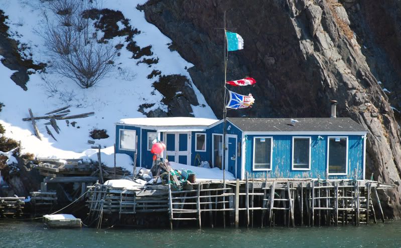
These first ones are from St. John's, Newfoundland. This one I used Photoshop to darken it, about like underexposing a print, but the original is a little lighter.
DSC_0309A.jpg


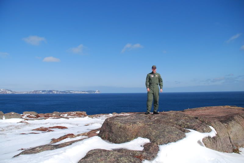
This one doesn't look too bad this small, but when viewed at full size, everything is rather washed out.
DSC_0321.jpg


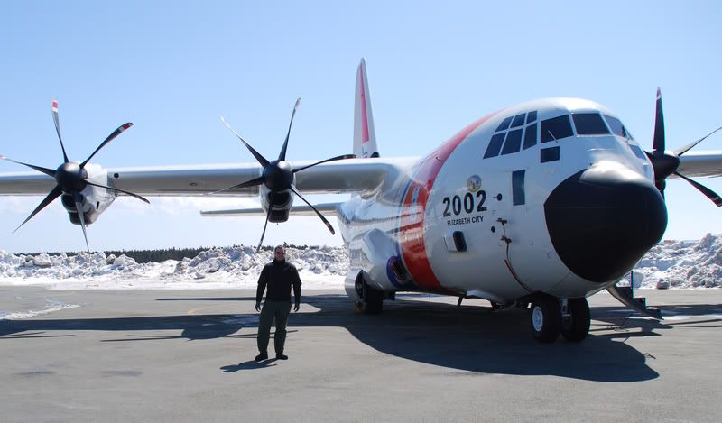
Me in front of the plane in St. Johns. Colors are washed out like almost all my other shots from that trip, shot as exposed.
DSC_0421A.jpg


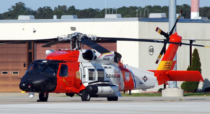
This is one of the HH-60's, with no exposure compensation, though I played with the levels on Photoshop a bit. Even before I put it on Photoshop, the colors were pretty good.
DSC_0121A.jpg


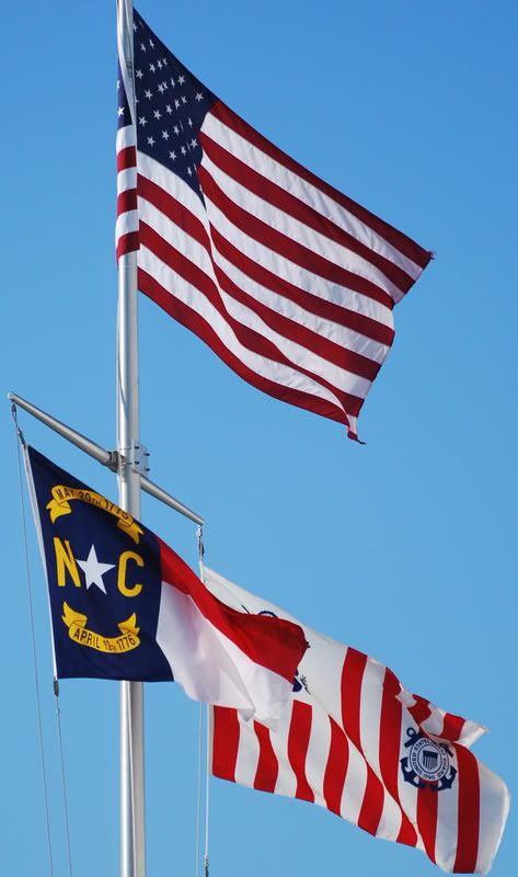
Flag pole outside the hanger, also with no exposure compensation, though this one I did not put on Photoshop at all, thats exactly as I shot it.
DSC_0126.jpg


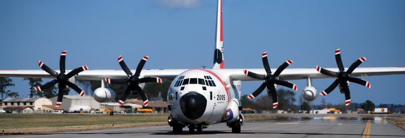
One of the planes taxing, this one shot with a .7 exposure comp. I took a few at other exposures and this one came out best, the one with no compensation was way too light.
DSC_0018A.jpg
 
Last edited:

Mlachica

TheRAMadaINN on Instagram
I'm in awe of all the great work here. There's plenty of talent on the forum.

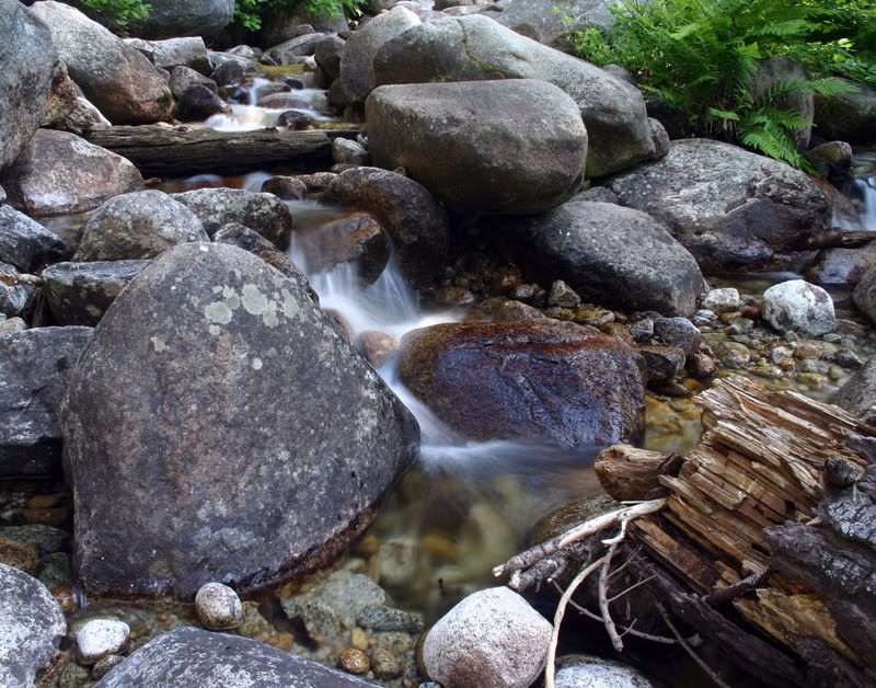
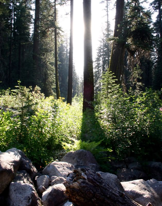
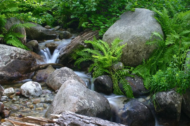
I have a few pictures from the Sequoia National Forest that could use some critique.

I really like the detail found in the waterfall one's but there's something about these pictures that I just don't like and I can't put my finger on it.

IMG_2836.jpg


IMG_3016.jpg


IMG_2834c.jpg


Thanks!
 

Photog

Explorer
Clark White said:
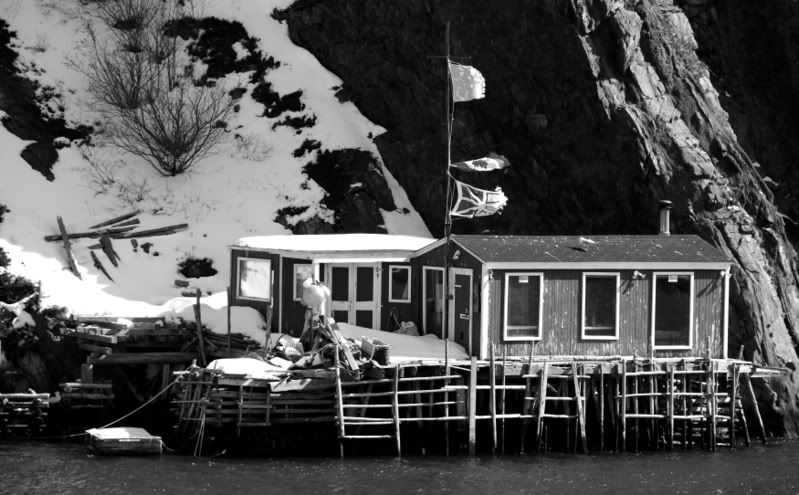
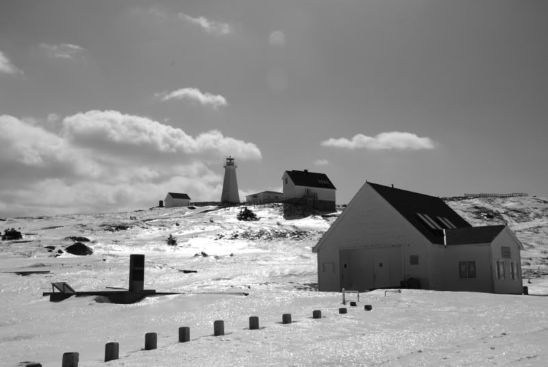
Heres a few shots from the St. John's trip that I turned to black and white. What do you think?

DSC_0309B.jpg


DSC_0405A.jpg

These two B&W's look great. There are some white areas that have lost some detail. When creating B&W images, make sure the white is a little below the max RGB numbers (256,256,256) and the black is a little above the minimum RGB numbers (0,0,0), by about 10 points. In Photoshop, use the "Channels" to convert it to B&W. Then you can push the colors around, and see how it affects the B&W output. It is like using filters.

It is also good that you are understanding your light meter, and its inaccuracies.

Everyone:
The light meter is designed to give you a proper exposure, when it is aimed at a mid-tone subject. Snow is lighter than mid tone. If you aim your camera at snow, and adjust the settings to allow the meter reeding to be -0-, the snow will be under exposed, and come out grey (mid tone). Also, the Matrix-Metering systems work well in most situations; but not the extreem situations.
 

Photog

Explorer
Mlachica said:
I'm in awe of all the great work here. There's plenty of talent on the forum.

I have a few pictures from the Sequoia National Forest that could use some critique.

I really like the detail found in the waterfall one's but there's something about these pictures that I just don't like and I can't put my finger on it.

IMG_2836.jpg


IMG_3016.jpg


IMG_2834c.jpg


Thanks!

Mark,
The two water falls are nicely exposed. I like the first one better; but there is more photo than you need to show the waterfall.

Crop the right side off, and bring the bottom up also. Maybe crop it up far enough to remove the distracting twig. While cropping, keep an eye on the remaining composition.
Something like this: (Crop, dodge, burn, saturate)
IMG_2836c.jpg


The second image has way too much contrast for the camera. I bet it was spectacular to look at, with your eyes. About the only way these types of images work, is with a fair amount of fog, to reduce the contrast. Unfortunately, it is this contrast that that draws our attention to many sceens in the first place.
 
Last edited:

Photog

Explorer
Clark,
I love the vibrant colors in this image. This machine looks great!

DSC_0121A.jpg


If you get another chance to photograph one of these birds, see if there is an angle that has a more simple background. In this case, if it was just the hanger doors as a back ground. The light pole, tree, etc are distracting.

A friend of mine, that does a lot of AOG shooting, uses a step ladder, to provide a different perspective view of the planes. You probably have acces to other things, such as vehicles & trailers, to elevate the perspective.

It looks like a perfect exposure, with detail in the blacks and whites.:wings:


This one is very nice also. It would be close to perfect, if the props looked like they were moving.
Slow the shutter speed down to get this effect (do some experiments to see which shutter speed looks best).
With a slower shutter speed, you might have some blur due to the motion of the airplane. You might have to wait for that moment when the plane slows down to make the turn onto the runway.

DSC_0018A.jpg


You definitely have some great subjects to work with.!:clapsmile
 
Last edited:

Clark White

Explorer
Photog, I just saw your comments on my photo's! Sorry it took me so long to notice, I've been stupid busy this last week. If it ever stops raining here I will try to take some more shots, and play with your suggestions. I've found it surprisingly difficult to get shots of the planes taxing with out the image being blurred by their motion. I think our pilots like to think they are hotshots, either that or they don't know what brakes are for. However, I think if I can get them coming down the other taxiway, I can get a better angle, get closer with out being in the way, and hopefully get a real nice shot with the props moving, but the airframe still clear. I will also try the hilo's from the other side so it has a less complicated background. I'll post up when I get out there again. Thanks again!

Clark
 

Photog

Explorer
Clark,
You will be amazed at the improvements, thee efforts will make, in your image quality and impact.

I have seen many folks here really improve, and gain confidence in there image making abilities.

Congrats everyone:clapsmile
 

Photog

Explorer
norseman said:
Local landscape from here on the coast of north west Highlands of Scotland. Pull to pieces and educate me.
Norsman,
Welcome to the Critiquing thread. This image captures a very beautiful area in the UK.


We will do this, one bite at a time.

Q: What is the subject? What attracted you to this scene? Does this image capture that feeling?

IsleofEwe1600size.jpg


If the subject is the whole view, then consider cropping out the areas that don't contribute anything.

I like the cloud in the sky; but the foreground doesn't do anything for me.

I would start, by cropping the bottom (foreground) off. This will also move the horizon line off the middle of the image (horizon in middle tend to cut image in half - not usually desirable). This will make the image look like a panorama.

With the crop complete, the remaining portion of the image needs more contrast. Increase the blacks, and saturation a bit (be careful, it is easy to over do this).

If the subject is not the whole view; but something more specific, then let us know, and we can work with that.

This is what I am seeing within this image; but it may not be what your vision was, of this scene. I might even add an orange filter to it, for a warmenr evening light. Think about the questions above, and let us know.
IsleofEwe1600cl2.jpg


I also see an image on the right side, with the whole cloud and the buildings.
 
Last edited:

norseman

New member
Hi Brian,

Thanks for the comments, the pic is of the immediate area where I live on the shore of Loch Ewe, west coast of northern Scottish Highlands. I wanted to show as much as I could of the character of the area with its generally muted tones, with a succession of horizons, retaining a good sense of recession to give an indication of scale. There is beautiful cloud detail which was lost in your rendition, which incidentally I did like.

My general approach is to shoot large and then look for crops that will make separate images bringing out different aspects and details from within the original. This often prompts me to go out and re shoot details as full frame at which point there is a new generation of sub images.

Enough said for now suffice it to say here is the original full frame pic followed by some derivitives.

David Gudmunsen
 
Last edited:

7wt

Expedition Leader
More fire truck. This one I took a while back and is one of my favorites but for some reason I haven't posted it. I like experimenting with backlighting on large things like trains and trucks.
CSC_0031.jpg
 

Photog

Explorer
norseman said:
Hi Brian,

Thanks for the comments, the pic is of the immediate area where I live on the shore of Loch Ewe, west coast of northern Scottish Highlands. I wanted to show as much as I could of the character of the area with its generally muted tones, with a succession of horizons, retaining a good sense of recession to give an indication of scale. There is beautiful cloud detail which was lost in your rendition, which incidentally I did like.

My general approach is to shoot large and then look for crops that will make separate images bringing out different aspects and details from within the original. This often prompts me to go out and re shoot details as full frame at which point there is a new generation of sub images.

Enough said for now suffice it to say here is the original full frame pic followed by some derivitives.

David Gudmunsen

David,
I like the 2nd and 3rd versions of the image, as you have prepared them. They show the mointains in the background much better. My favorite is the 2nd image. Good contrast, wide view, no extra foreground or sky.

Very interesting location. Looks like it might be difficult to drive in many places (too steep or too deep).
 

Photog

Explorer
7wt said:
More fire truck. This one I took a while back and is one of my favorites but for some reason I haven't posted it. I like experimenting with backlighting on large things like trains and trucks.
CSC_0031.jpg

Now that is nice. Excellent composition, good drama, and powerful feel. The truck covers the right 2/3 of the image, leaving 1/3 to the left. The open space is in front of the truck, giving us the feeling it has room to move forward. It looks to be focused well, and using a small aperture, for good depth-of-field.

I would Photoshop out the STOP sign and the two posts, to smooth out the image.

See if you can tone down the bright sky just a little, but not the truck. The sky is demanding a bit too much attention. If you can't, it is still a very strong image.:26_7_2:
 
Last edited:

Forum statistics

Threads
188,291
Messages
2,904,968
Members
229,961
Latest member
bdpkauai
Top