Photo Critiqing Thread

Photog

Explorer
TeleScooby said:
Here are a couple that I'm going nuts trying to figure out. there's just something I feel could be better:

Forest1.jpg


Have a black and white of this one too...love it, but what's not right?
This type of forest photograph, has always captured my attention. When standing there, you feel like you are standing in a fairy tale. I have never been able to capture that feeling in my photographs. There is no subject, and the image is very busy. Sometimes, in the autumn, you can have some color contrast, and create a subject with that. Your eye just does not know where to look. THe dark trees on the left & right do tend to keep you froom leaving the photograph. That does work. A trail through the forest draws you in, and gives your eye someplace to go.


TeleScooby said:
BritishCars001.jpg

Experimenting with cropping...did it work?


I have several of my other favorites in a gallery here

Really appreciate this thread!

This did work. The image feels good. Some of the reflection is busy, and distracting. Some things can't be controled in a public setting; but the problems still exist. Maybe boost the saturation a bit, and let us see the red side panel better. I really enjoy vehicle detail images.

Side note: The auto manufacturers have their cars posed in large studios, with very controled lighting, when they start photographing the details. This eliminates the busy reflections. I really like the full body shots taken in the desert, where the evening sky is used for the smooth lighting. Not accurate coloring; but very dramatic.

Studio Shot
Photo copyrighted by Daimler-Chrysler 2008 Dodge Viper SRT-10
dc_08viperconv.jpg
 
Last edited:

Photog

Explorer
Yes. That is what I was thinking about. Nice, bold red & blue. When comparing them side-by-side, which one do you like better?
BritishCars001.jpg
BritishCars001-1.jpg
 

TeleScooby

Adventurer
Photog said:
Yes. That is what I was thinking about. Nice, bold red & blue. When comparing them side-by-side, which one do you like better?


Well, now the first looks totally flat...I'm going to keep playing with this one and try to get the reflections toned down a little more, but I definitely like the monkeyed with version better!
 

pwc

Explorer
TeleScooby said:
Well, now the first looks totally flat...I'm going to keep playing with this one and try to get the reflections toned down a little more, but I definitely like the monkeyed with version better!

I'm not near a useful computer at the moment, but would taking it black and white bring more attention to the details, if that's what you're looking for?
 

Clark White

Explorer
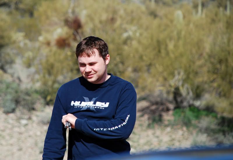
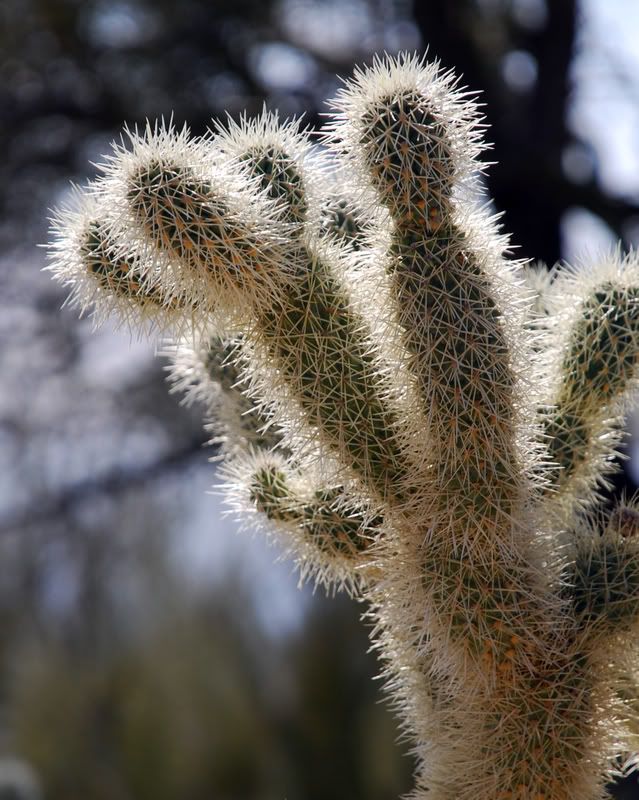
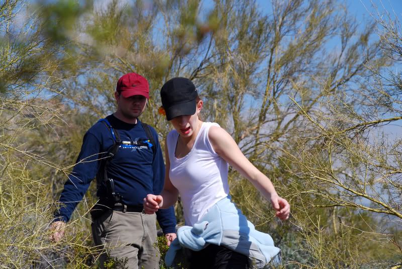
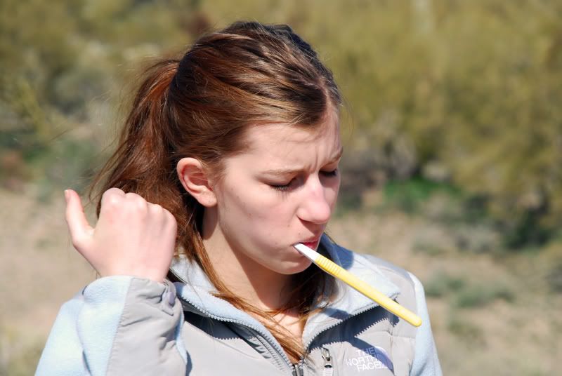
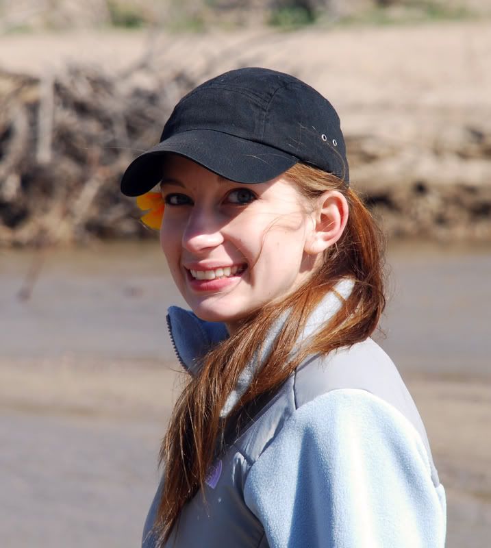
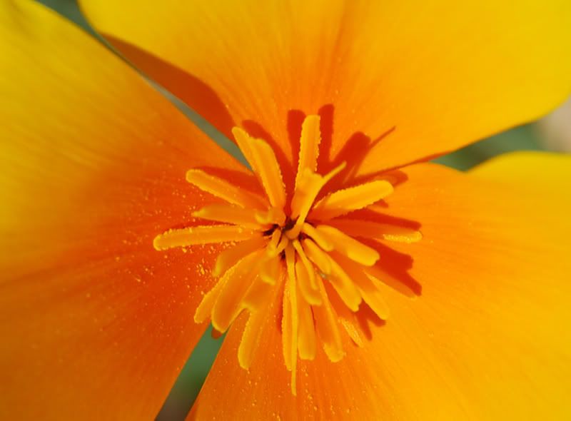
These are some of the pictures I took last week when I went home on leave. I have played with them some, but I'm used to 35mm black and white, so digital color and Adobe Photo Shop kinda confuse me. What would you all suggest to improve them?

DSC_0090A.jpg


DSC_0124A.jpg


DSC_0134A.jpg


DSC_0098A.jpg


DSC_0165A.jpg


DSC_0229A.jpg


Sorry for posting some many, but I just got a Nikon D40x, so I'm really excited to learn how to use it and Adobe to their fullest. Thanks for any suggestions you have! :coffeedrink:

Clark
 

Photog

Explorer
Clark,
Your exposure focus and composition are good.

When you can see a person's eyes, they will look better, with a little spark of reflection (catch-light).

You can do this, by using your flash, in the daytime. It will do two things:
1) It will add a little light, in the shadows under a hat,
2) It will add that little catch-light that gives the eyes life.

Set youor flas to be at -1 to -2, and try it outside, with a friend, wearing a hat, and without a hat. Make sure the hat is shadowing the face, similar to the image of the girl. I think you will be pleased with the results.

Critique on: 1) Try cropping the 1st photo, into a verticle of the man. The rest of the photo isn't adding anything to the story. You did place him at the 1/3 mark; the problem is, he is facing away from the other 2/3.

The cactus is perfect. Check the full res file, to see if the tines are sharp. Composition, exposure, direction of light -- -- PERFECT.

Couple hiking - I wish I could see their faces & eyes. Other wise it is technically OK. That looks like a hard carry to draw from.

Toothbrush - I don't think she is going to like that one. Her eyes are closed, the brush is distorting her face, and the brush must have bitten her hand, to make her let go of it.

Portrait of girl in hat - Perfect, except for the catch-light, and harsh shadow on face.

Now the flower. Great color and focus. I never have liked flowers shot straight down the middle. The harsh light and strong shadows are also distracting. If you have any flowers in the neighborhood, go out and try this again; but this time, block the sunshine with your body. You will have to change the white balance, because then the flower will be lit with a big blue sky. Blue will make the colors muted and cold. Compose the stamen at the rule of thirds. Then try getting down beside the flower, and shoot across it, instead of straight in, and watch the background for bright distractions.

Excellent start, and nice images to play with.

Cheers.!
 

Clark White

Explorer
Awesome, thank you both! I will be checking out those sites later tonight when I finish studying for my SCUBA refresher tomorrow.
PHOTOG, thank you very much for your advice, I am playing with the adjustments you suggested, and will play with you suggestions with flash and flower comp. As far as the tooth brush pic, I ******** :xxrotflma . I see what you mean. I was thinking it was a good action shot, but your right, I think Kelsey might just ********** me when she finds out I put that pic up. :violent-smiley-031:

Thanks again both, cheers! :beer:

P.S. I checked the full res version of the cactus shot and the tines are indeed sharp.
 
Last edited:

Ursidae69

Traveller
Framing

I was in DC last week for a few days and took a lot of pictures of the Washington Memorial. I often find myself wondering the best way to frame things. I tried various ways of framing the Memorial. Any thoughts on framing something like this?
 

Photog

Explorer
Ursidae69 said:
I was in DC last week for a few days and took a lot of pictures of the Washington Memorial. I often find myself wondering the best way to frame things. I tried various ways of framing the Memorial. Any thoughts on framing something like this?

First, I want to commend you on trying so many different angles and perspectives on this one subject. That is how to get the job done, for a few reasons. First, you capture it in a number of ways, and as you go, you start to get a feel for the subject, even a sense of the story or feeling you want to create in the image.

The structure of the Washington Monument is a plain spire shape, nothing spectacular. Since it is tall, you may give it a powerful feeling like this photo does. The moon is cool; but it is too small to add anything to the pic.

The reflection is great, and would look good, printed large, hanging on a wall.

The silhouette images don't do anything for me, personally. The light post seems to diminish the monument. Kudo for trying it, though.

The other two shots, with the moon on top, and the flags at the bottom, are a good start. You definitely had the right idea. The further away from the monument you get, the larger the moon will appear, relative to the monument. The problem is, the moon will also seem to rise further above the monument. Folks that like to use the moon as a subject, keep a set of charts available (you can get them on your GPS and Palm Pilot). They would see the shot you took, then back away from the monument, until the moon was the right size (personal taste). If the moon was too far above the monument, they would check their charts, to see if it would be lower in the sky, during another cycle. They would then return during a different cycle, and capture the image they imagined the first time.

Great moon shots are very cool, and worth the effort. I have a couple on my list, and I hope to create them this year (without Photoshop cut & paste).

You must have done some work at the base of the monument, using the flags as a design subject. Those would be interesting to see.

I like the 1st reflection one the best. off center, and not too skinny. You may want to adjust the crop just a little. It does not feel like it is perfectly vertical.

Again, GREAT effort and ideas.
 
Last edited:

Blacknmuddy

Observer
Thought I would throw a few shots in, not a schnazzy camera, But I got one.

Agua Dulce Fire, Aftermath
fire082ck0.jpg


Lucerne Valley, Desert Sunset
desert034bb6.jpg
 

Ursidae69

Traveller
Photog, thanks for the excellent feedback. I adjusted the crop on the reflection shot. On a subject like this, I can't decide if it is best to have it centered or slightly off-center. I am digging the silhouette with the stop light, it was just a weird shot. :) I attached another picture from the Lincoln Memorial. This was shot with the built-in flash. If I had a better flash then this might have had better white balance across the whole image. The hardest part about trying to take different shots was dealing with the crowds, there were so many people........

Thanks again. :costumed-smiley-007
 

Fergie

Expedition Leader
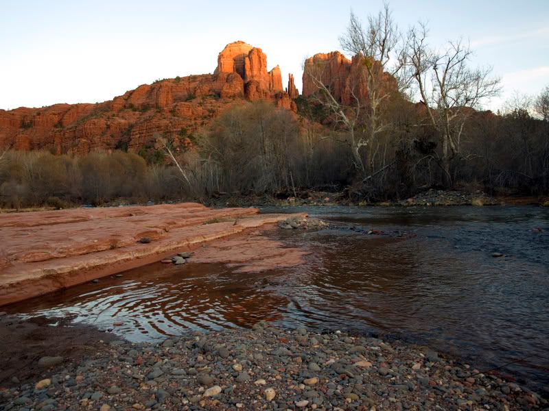
Here is one from another member of my family:
Cathedral_Rock.jpg


I've tried vertical crops with just the left section of the Rock, and horizontal with the rocks, but nothing solid.

Any help is appreciated.
 

Forum statistics

Threads
188,249
Messages
2,904,493
Members
229,805
Latest member
Chonker LMTV
Top