Photo Critiqing Thread

Photog

Explorer
Clark,
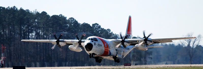
Here is my favorite. The plane is off the ground, you can see the prop condensation, the lighting is good and I love airplanes.
I like this particular crop, because most of the sky (blah) is gone, and there is a little more space in front of the plane than behind. The plane looks large and powerful. If it were really sharp, it would look great printed large (2ft x 8ft). You might do a white balance on the shadey side of the plane. It is a little blue (cool). Maybe 1/2 way between current white balance and white on the shadey side (does that make sense?).
DSC_0030B.jpg


I like the choppers; but I don't care for them being back-lit (sun behind the subject). Crossing or diagonal light makes the birds look better.

You can get the feeling of motion, by slowing down the shutter, and moving the camera with the bird, as you squeeze the trigger (like tracking with a moving target).

Cold mornings have less mirage, and the cold air magnifies the subject. I'm looking forward to some more of these images. Nice work. :wings:
 
Last edited:

Clark White

Explorer
I was thinking about the same things. I wish I could have gotten in front of the choppers, but that would have put me out on the runway, which as you can imagine would get me in a big steaming pile of poo. It's cooling off for the next few days, so I might get lucky in the morning with no heat waves, lets just hope theres some non lazy pilots who get up and fly that early! I'm going flying tomorrow, so hopefully I will be able to get some aerial photos then. When I get home I will play with that white balance and see what I can do. Thanks much!
Clark
 

nwoods

Expedition Leader
railbat said:
Got a break in the weather on Tuesday night and was able to get down to the waterfront before sundown. I posted a few versions of one photo subject to see what others thought of the options. Photos are here: http://www.pbase.com/railbat/3408_photos

Regards,

Brian

Chain2 and Wheel2 are my fav's. Photog can probably articulate why much better than I can.
 

Photog

Explorer
The colors are wonderful. The composition and cropping selection is well thought out. you could adjust saturation, black point and play with son vignetting, to create a strong image from Wheel 1.

I like Chain 2 because the pipes are laid horizontal, the image is framed horizontal, and the chain is placed along the rule of thirds.
93774945.MFkbu53H.jpg


I also like the Wheel 1 image best. It has all the information for a railroad story. Tracks, rail cars and wheel trucks are all horizontal subjects. The horizontal image feels better. The wheel hub is placed on the right third also.
93774947.hK4HOvHL.jpg
 
Last edited:

Photog

Explorer
nwoods said:
Chain2 and Wheel2 are my fav's. Photog can probably articulate why much better than I can.

Please tell what draws you to Wheel 2. I'm always interested in perceptions of images. Learning this is what helps me create images pleasing to more people.

Your architecture background has given you feel for ratios that are pleasing to the eye. Ratios of shape, color, light/dark, texture, etc. All this helps when considering the composition of photographs. Your website has many nicely done images.
 
Last edited:

Photog

Explorer
There are a number of other well qualified photographers in the Expo group. It would be great to have thier input here. I am certainly NOT the "all knowing" photographer here. Just a photographer.
 
Last edited:

nwoods

Expedition Leader
Photog said:
Please tell what draws you to Wheel 2.
Ha ha, with a build up like that, I guess I HAVE to contribute some, eh? LOL.

Okay, in a nutshell, Wheel2 Draws me in. The longer forground helps bring me into the photo, focusing me on the subject of interest, which is the superbly crisp wheel itself. Once I'm into the photo (after having been drawn in), I gravitate towards the stamping on the control arm or whatever they are called on trains, as well as the marbled patina of the wheel itself.

To me, this photo is invitation to immerse myself in a story.

I like it.

93774950.XHhizqPf.jpg


Edit: I just realized you used the word "draws" also. I don't think I used it subconciously as a result. It is a near physical compellation that I feel when I look at the image.
 

mizedog

Observer
Just a big thanks and gesture of respect to all of you.

Your gifts and skill amaze and inspire me. In the expedition spirit, you're getting out of your comfort zones to capture adventure, nature, beauty, etc. I know much of the success of photography comes from getting up very early, just to meet the right lighting.

If I could, I'd buy you all a good cup of coffee!

Thanks again.
 

Photog

Explorer
nwoods said:
Ha ha, with a build up like that, I guess I HAVE to contribute some, eh? LOL.

Okay, in a nutshell, Wheel2 Draws me in. The longer forground helps bring me into the photo, focusing me on the subject of interest, which is the superbly crisp wheel itself. Once I'm into the photo (after having been drawn in), I gravitate towards the stamping on the control arm or whatever they are called on trains, as well as the marbled patina of the wheel itself.

To me, this photo is invitation to immerse myself in a story.

I like it.

93774950.XHhizqPf.jpg


Edit: I just realized you used the word "draws" also. I don't think I used it subconciously as a result. It is a near physical compellation that I feel when I look at the image.

This thought project will help in creating your next set of images.

As for this "Wheel 2" photo: I would like it better, if there were a little more contrast in the RR tracks, in the foreground. Just a little more definition.
 

Railvan

Adventurer
Photog said:
This thought project will help in creating your next set of images.

As for this "Wheel 2" photo: I would like it better, if there were a little more contrast in the RR tracks, in the foreground. Just a little more definition.

Good input. Here's a before and after. In the horizontal image I added a slight contrast bump overall, and burned and added more contrast to the lower rail area, to focus the eye more on the wheel. I also burned the lower section of the truck sideframe (the area at the right edge below the white numbers). On the vertical image I burned the lower rail area and added contrast to this area as well.

Brian R
 
Last edited:

Photog

Explorer
Brian R,
That is exactly the type of adjustment I was refering to. I like the verticle wheel image much better that way. The color saturation on both have been pushed up a bit high; it almost does not look like rust anymore. The color of the "Wheel 1 Start" seems more realistic. The adjusted images almost seem like the color balance wasn't quite right.

That being said, I won't fault you for trying this. It can really help a great many images.

It is also super easy to go a little too far. It may have looked perfect at the time you were doing it; but little things affect our vision. Coffee, beer, late night, room color, being male instead of female, etc. ANd I'm not joking about being a male. The best photo labs always have women controlling color adjustments. THey are much more consistant, and have almost no color problems with their vision.

Nice work Brian.:D Thanks for re-postin with the adjustments.
 

7wt

Expedition Leader
Photog said:
DSC_0084_2.jpg

If I were creating a competition print, I would copy a little tree structure over to the sky, to separate the sky from the blown-snow. I would also do a little dodge/burn to draw more attention tothe snow-blower and blown-snow.
Brian,

I took your advice and looked through what I had and I think this is closer to what I should have posted in the first place. Thanks for all your help, not only are my pictures looking better but my eye for weeding out what I have is improving as well.
DSC_0064_2.jpg
 

Forum statistics

Threads
188,259
Messages
2,904,641
Members
229,805
Latest member
Chonker LMTV
Top